
Stripes
Created by accident but refined on purpose, Stripes is a beautiful new wallpaper collection for your Apple devices.
Introducing Stripes, a beautiful new wallpaper collection for your Apple Devices.
Design “Process”
People sometimes ask me to share my design process for the wallpapers I create, but the most well-meaning response is that I really don't know. It's a lot of play and trial and error, eventually stumbling across an aesthetic that looks like something I want to pursue further, after which a period of experimentation and refining begins.

The design began its life as an accidentally stretched out version of my 2024 Commander design.
In the case of Stripes, the origin of this wallpaper began after I completed my 2024 Commander t-shirt design. While scaling it, I forgot to lock the Constrain Proportions toggle and ended up stretching the Commander Design along the X-Axis instead of proportionally. Something about that look intrigued me, so I blurred the lines using a motion blur to smooth out the colours horizontally. I liked the direction my experimentation was starting to go, and I felt I had something pretty cool on my hands.
So I went back into Sketch, took my Commander design, and added and stretched out the lines to fill out the dimensions of a large panel like an XDR display. I added colours, moved things around, and organized it until I was satisfied with the result.
Those 45 horizontal lines were exported back into Pixelmator Pro and motion-blurred repeatedly to create the right blend between colours. In the end, six layers using the original 45-line piece were offset, stacked, and colour-adjusted over and around each other, creating a unique effect. Changes in exposure and transparency helped create thin, more prominent bands between each line, creating a compelling contrast that gives this wallpaper a distinctive appearance.

Bands on bands on bands. Six offset layers of 45-lines comprise the Stripes collection.
From there, I played with colours and different gradients to find patterns that sparked joy. I applied them across my devices for a few days to 1) see how they looked on my devices and 2) test whether I still liked them after a few days. If I did, it made it into the collection; if I didn't, it got reworked or scrapped.
The Wallpaper

Previewing the ten designs in the first Stripes wallpaper collection.
I've included ten designs in this first set, using colours that stood out to me while creating them. All ten wallpapers are available for the iPhone, iPad, and Mac. Because the combinations are truly endless, this is just a first set—I hope to create a few more colour combinations to supplement these in future releases . Enjoy!
And if you want and are able to donate to support my work, tips are always much appreciated:
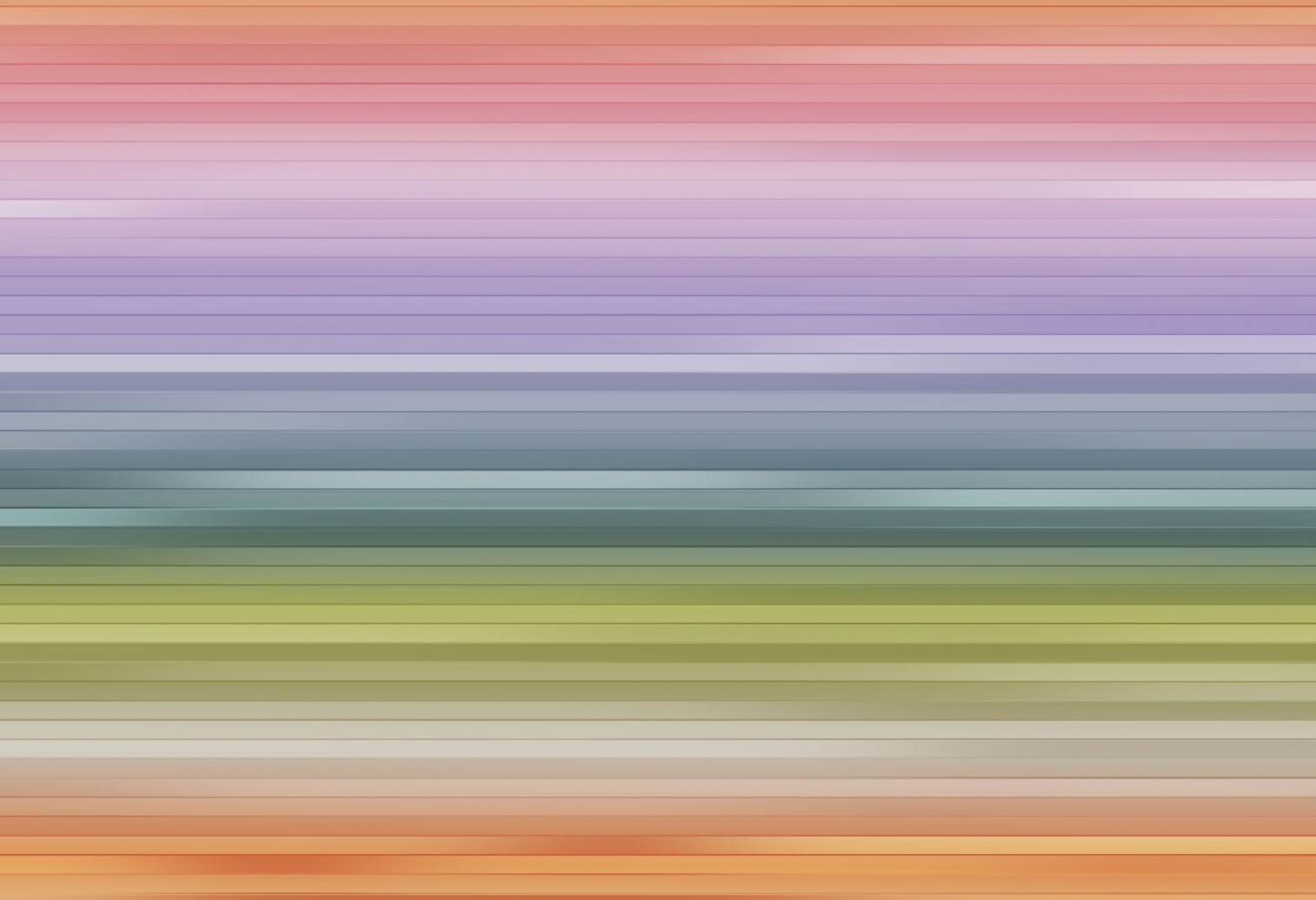
The Pastel Field
I'll start with my favourite of the bunch. This wallpaper utilized mossy greens, lavenders, and soft rust colour tones to create a design that reminds me of a field in the early morning light.
The Aztec One
This design references the colours used in Aztec culture and art. Reds, blues, browns, yellows, and whites are incorporated into this bold wallpaper.
The Dark Mode One
Whenever I make a new design, one of the first comments to pop up is a variation: "Are you going to make a dark mode version?" So yes, I will, and here it is. It’s a lovely deep slate colour that references the subtle blue tones of the iPhone 5 & Apple’s Midnight MacBooks.

It’s Giving Beach
Aptly named (I think), this wallpaper gives me beach vibes; that transition from the foot-roasting sand to the gentle foam of incoming waves to the deepening blue waters beyond.

The Golden One
Perhaps my second personal favourite of the bunch, The Golden One features an off-axis gradient of blue and yellow shades that reminds me of Golden Hour.

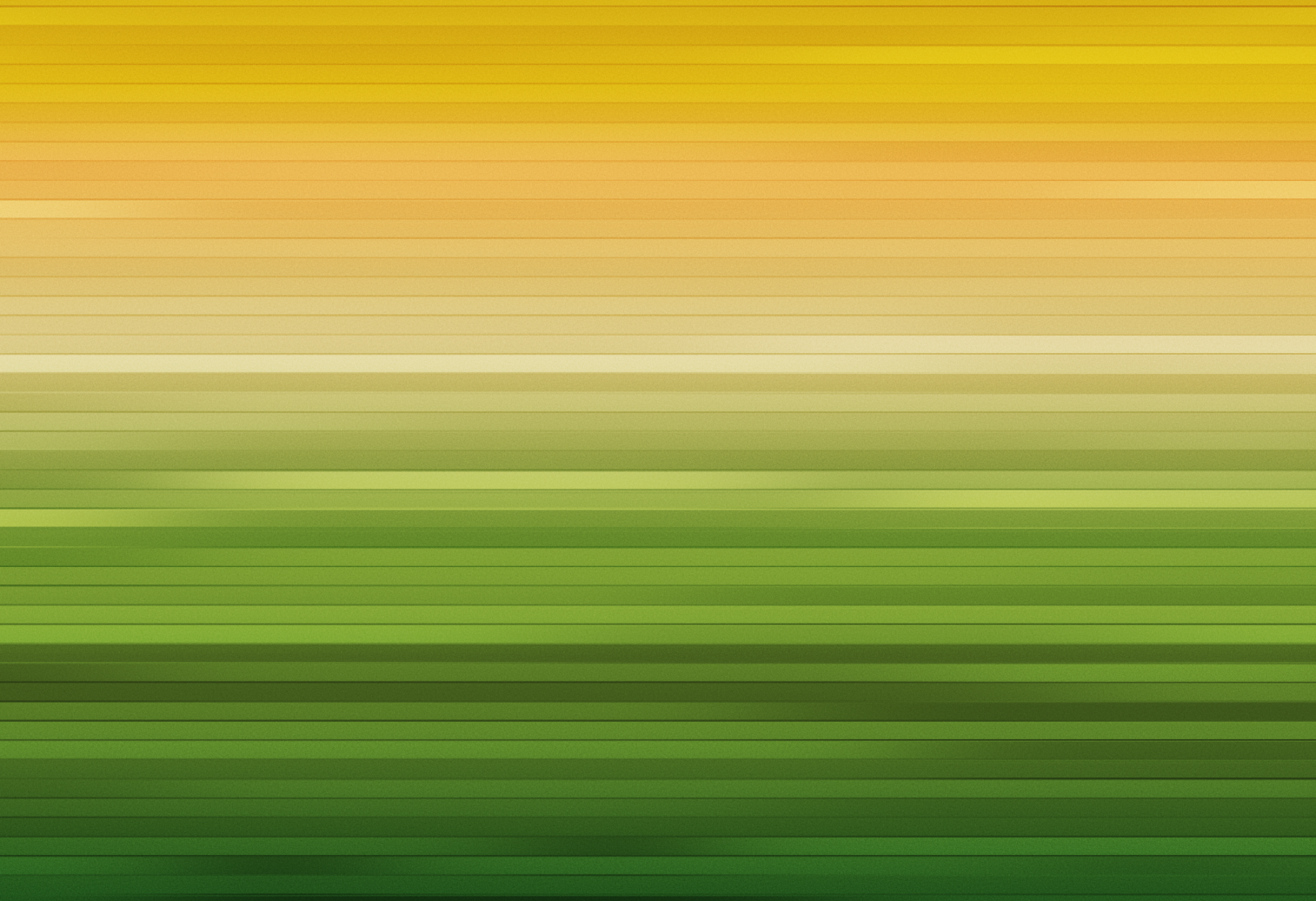
The Earthy One
Deep yellows and lush greens give wallpaper an earthy, freshly mowed lawn feeling.
The Underwater One
Inspired by underwater shallows, with white sands and cerulean waters illuminated by the sun.

The Deep Sea Blue One
The deeper we go, the more the depths scatter the light, turning the waters a colder, inkier, deeper blue. This is a lovely night mode compliment to The Underwater One wallpaper above.

The Verdant One
The green tones of foggy & humid high-elevation tropical forests inspired the colours used in this wallpaper.

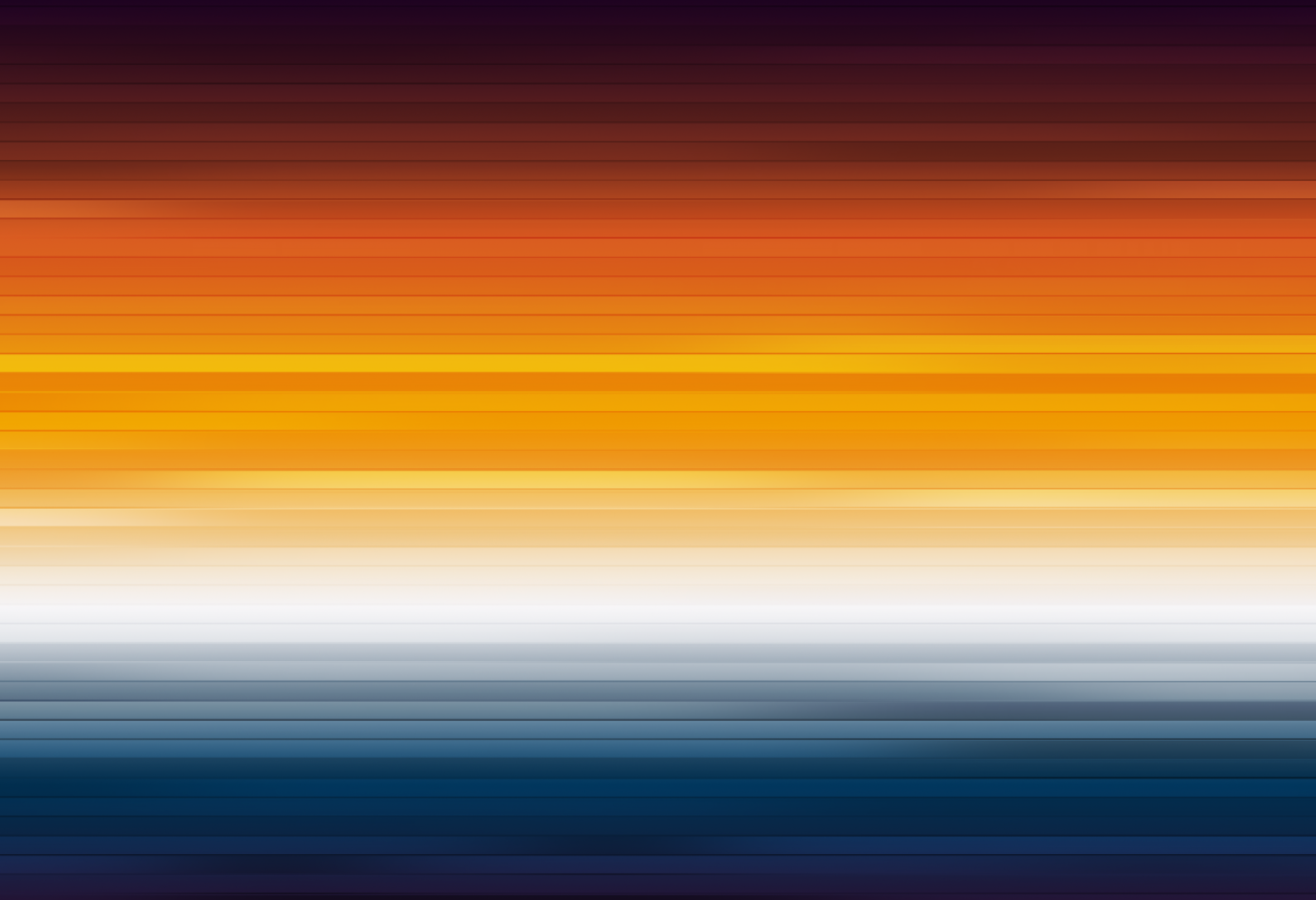
The Dusty Dusk One
The final deepening pinks, oranges, and purples of the night sky before nightfall sets in.

SUPPORT
I’m a one-person operation, working in healthcare by day & running this site as a passion project in my off time.
If you enjoy my work (the articles, the wallpapers, my general demeanour… anything really), consider leaving a tip & supporting the site. Your support is incredibly appreciated & goes a long way to keep this site and the works I produce ad-free & free of charge.