
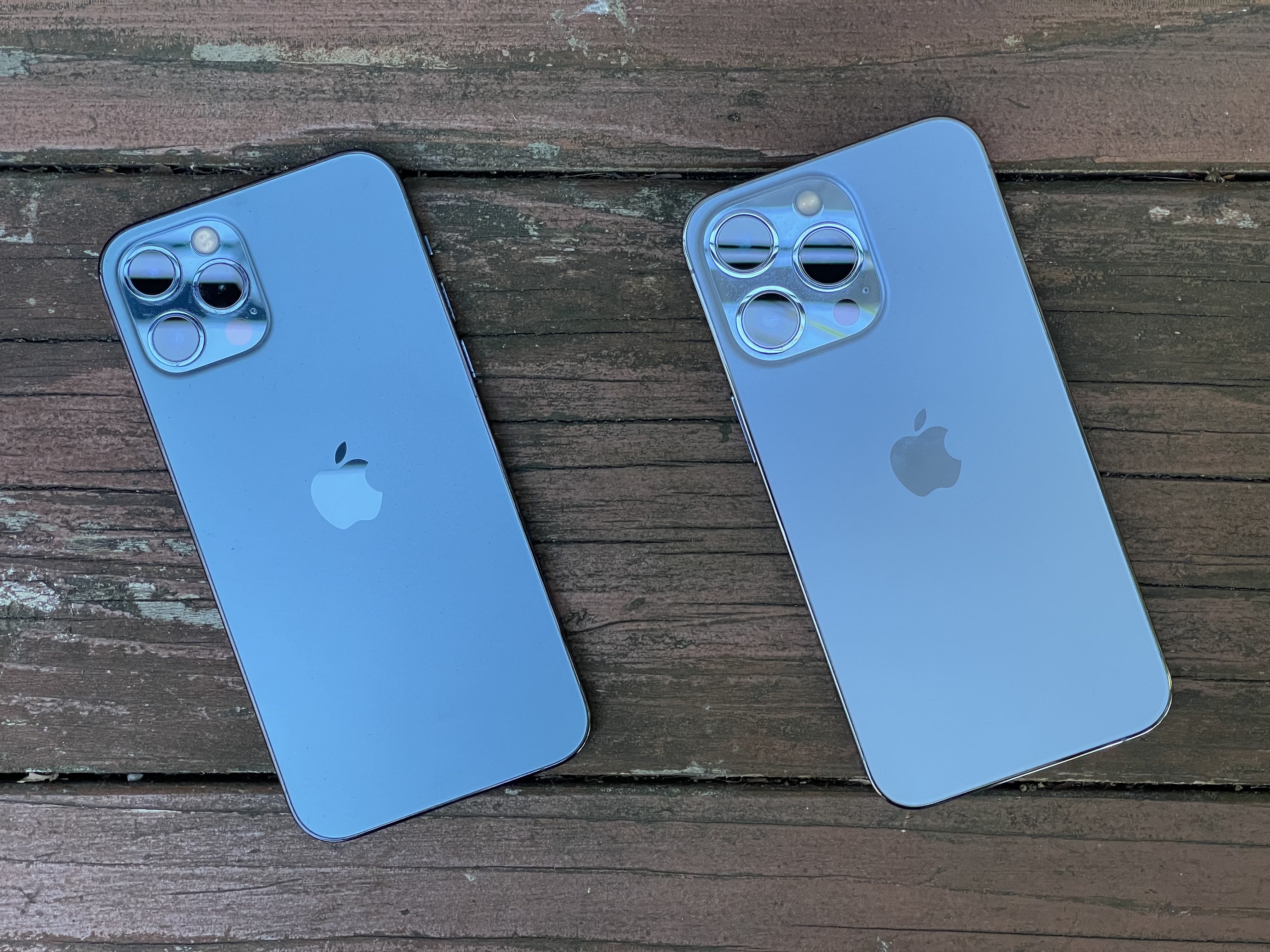
Confession time: I’ve got the Sierra Blue blues.
Like so many others, I absolutely love my iPhone 13 Pro. It’s the perfect size, and the amped-up camera works beautifully. (Love those macro shots!) Six months on, the performance, the reliability, that gorgeous ProMotion screen — it’s all fantastic.
But the one thing that fails to surprise and delight me after half a year is the Sierra Blue color I picked. It’s just … meh.
Sierra Blue color is perfect for minivans
As my colleague on The CultCast Erfon Elijah noted, last year’s hottest new iPhone Pro color is a completely inoffensive Honda minivan blue. Who could gripe about something so unobjectionable? I guess Erfon and I can.
Sierra Blue looks totally innocuous. The previous year’s Pacific Blue color option wasn’t exactly bold, but it wasn’t as bland as Sierra Blue. And the other iPhone 13 Pro color options are similarly staid: silver, gold and graphite.
So, why does Apple repeatedly choose such a muted color palette, especially for its iPhone Pro lineup? The “regular” iPhone and mini models get more exciting colors (and a little more razzle-dazzle in the nomenclature department): Midnight, Starlight, pink, blue and (Product) Red.
But even those pale in comparison to some really out-there Android phones. Oppo touts its Fantastic Purple A94 as “a kaleidoscopic purple bathed in liquid crystal that perfectly complements any style.”
I’m not sold on that particular hologram-looking device complementing “any style.” But it certainly stands out as a bold color option. Same goes for the Amber Sunrise Huawei P3 Pro.
Why hasn’t Apple created a blinding-orange iPhone Pro? Or something in an eye-melting florescent yellow/green, a vibrant royal blue or even the bronze color option that rumors indicated we would get last year? (Erfon’s still grousing about that failure, BTW.)
Heck, even a Product (Red) variant would stir things up.
I REALLY wish #iPhone13 Pro came in a color more exciting than Honda minivan blue… pic.twitter.com/hE7CVeKJIo
— Erfon Elijah (@erfon) September 14, 2021
More iPhone Pro color options, please
There’s a rumor that Apple will unveil a new green iPhone at Tuesday’s “Peek Performance” event. Last year, it dished out a purple iPhone 12 and 12 mini around this time of year, so a new green model shouldn’t come as much of a shock. Still, iPhone Pro buyers probably shouldn’t get their hopes up.
As it stands, iPhone 13 Pro comes in a bland lineup of muted colors that would not look out of place in a Banana Republic store.
Are they tasteful? Certainly. Are they tasty? Definitely not.
The iPhone 13 Pro lineup color options seem aimed for the boardroom more than the studio.
And to me, it seems like a slightly bizarre strategy. Apple likes to point out that you can shoot and edit a movie on an iPhone 13 Pro. Like, an actual feature film. That’s how high-end the pro iPhone models really are. Cupertino’s hip marketing materials routinely showcase filmmakers and musicians. For the high-achieving people in Apple’s ads, style clearly matters.
To me, the Sierra Blue iPhone 13 Pro seems like an entire house painted in simple white with ivory accents and clear maple floors. My house already looks like that. I don’t need my iPhone to cop that kind of neutral look.
It’s not like “pro“ users would shun something a little more exotic, either. In fact, the creative types who shoot Hollywood movies on iPhones seem like the ideal audience for bold colors that make a statement. Same goes for the YouTube and TikTok influencers who make mad money just by unboxing the latest gadgets.
For creators, individuality is king.
Apple: Too big to go bold?
Maybe it’s all about the numbers game. Perhaps Apple produces so many of the various iPhone models that it simply must whittle down the options to only those that will shift millions of units.
Maybe going out on a limb with a sparkling green iPhone 13 Pro would not financial make sense. Apple CEO Tim Cook probably has a Numbers document that shows exactly why Cupertino can’t make my colorful iPhone Pro dreams come true.
It’s not like Apple isn’t trying, though. In its press release announcing the iPhone 13 lineup, Apple said the Sierra Blue color was “created using multiple layers of nanometer-scale metallic ceramics applied across the surface for a stunning and durable finish.” So Cupertino clearly isn’t afraid to spend time, effort and money creating new industrial processes.
Outdoors vs. indoors
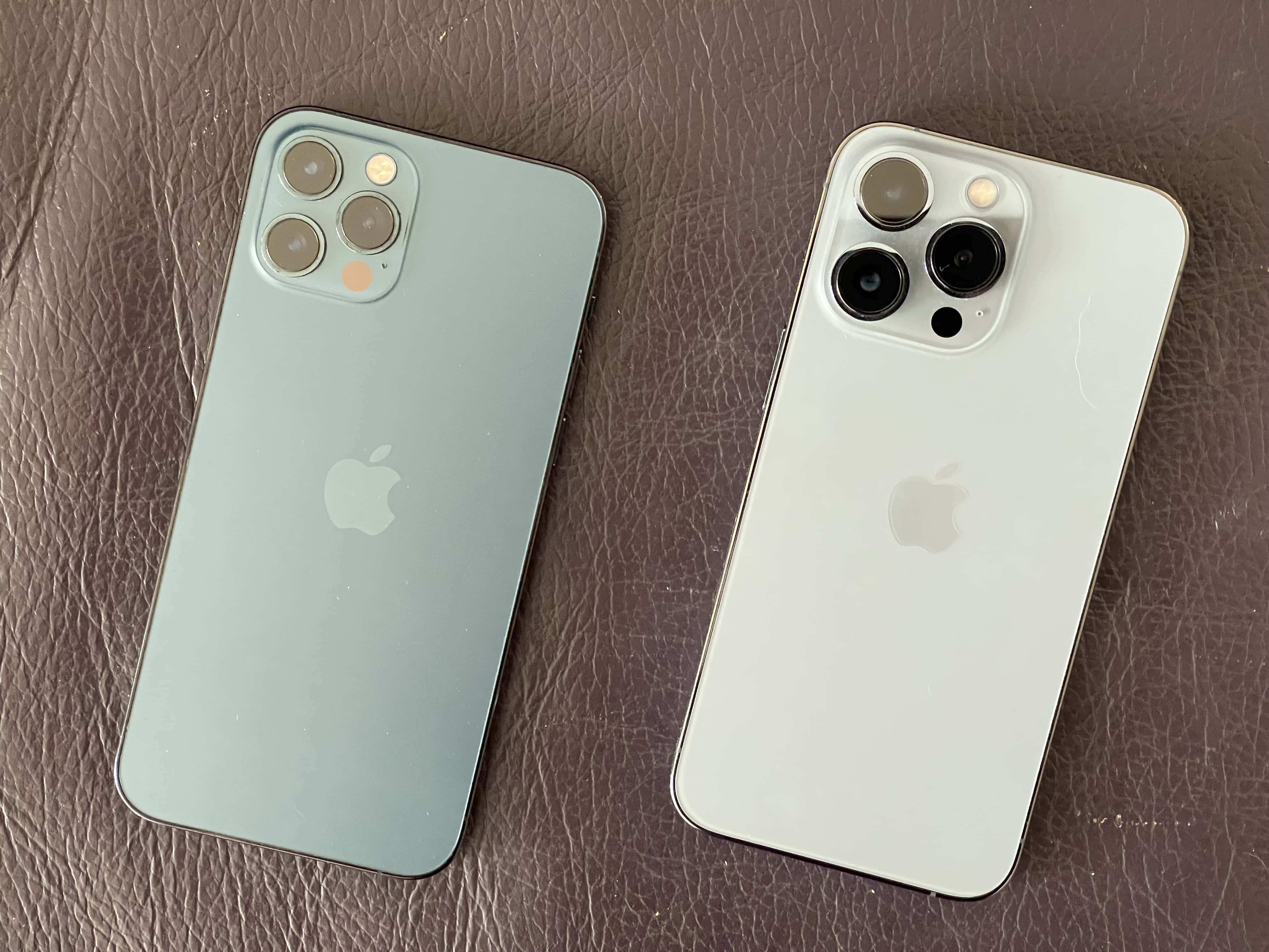
And it’s true. Just like 2020’s Pacific Blue iPhone 12 Pro, the Sierra Blue iPhone 13 Pro does look much better outdoors, with the California sunlight streaming down upon it. Maybe it’s always sunny in Cupertino.
Indoors, however — without the sun bringing out its highlights and causing its blue stainless steel frame to shimmer — Sierra Blue just looks like a dull, borderline gray (at least to my eyes). It’s the kind of pedestrian color choice you find on vintage gray steel filing cabinets at a thrift store.
Ultimately, it’s uninspiring.
I realize this is a first-world problem. Complaining about the color options for a $1,000 smartphone seems, on some level, the height of ridiculousness. Especially when there’s a war raging in Europe and Ukrainian developers are working in bathtubs to shelter from Russian bombardment.
And, truly, I do still love my Sierra Blue iPhone 13 Pro. I would prefer to keep it case-less so I can savor Apple’s impeccable industrial design. But after six months of staring at it, underwhelmed, I finally broke down and slapped on one of Apple’s silicon cases. At least that comes in a bright Product(Red) color option.
Apple’s history of colorful computers
There was a time when Apple pushed the boundaries of bold colors with its devices. In a vintage ad for the iMac G3 — the translucent blue computer that saved Apple’s ass in the late ’90s — actor Jeff Goldblum rails about the sad state of computers with boring beige cases back then.
“It’s one of the worst colors,” he says in the “Beige” ad, which you can watch below. “It’s hardly even a color. It’s like oatmeal or sand. There’s nothing. It’s beige, it’s boring, it’s bland…. Why in heaven’s name have the people who’ve made computers before never done anything good beige. That’s nuts. That’s nuts. Have they been in thinking jail? That’s crazy.”
It was crazy. And shortsighted. Apple went on to break the model with its wildly successful — and at times insanely colorful — computers.
It’s time for Apple to think different about colors again, and free the iPhone Pro from the tyranny of the muted color palette.

