Earlier this week, I published my review of iOS 16. As you may have seen, throughout the eight chapters of the story, I pointed out some of the flaws of iOS 16 and aspects I didn’t particularly like. That gave me an idea.
First, however, allow me to thank to everyone who read, enjoyed, and recommended the review. I’m glad the story resonated with MacStories readers. I take my responsibility to work on these annual reviews very seriously, and I’m excited about having found a format that lets me review a sprawling operating system such as iOS in a review that’s still approachable and fun to write.
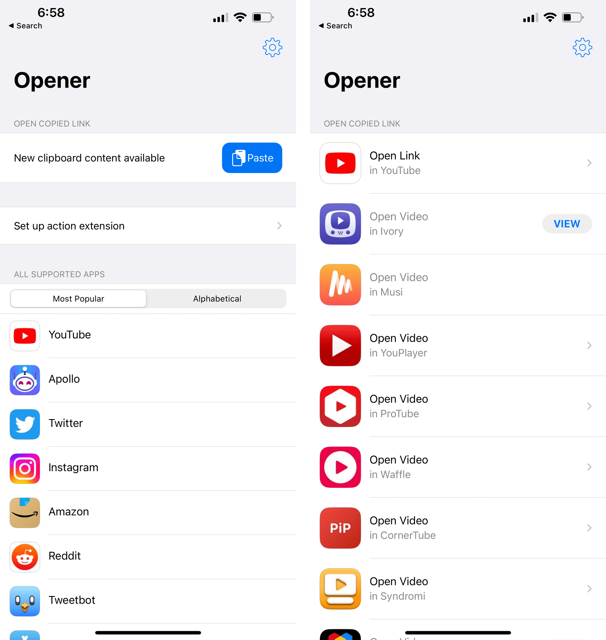
Anyway: as I was writing the review, I realized that I had several complaints about things I didn’t like in iOS 16 (shocker, I know). So I had an idea: I asked Finn Voorhees1 to work on an update to my Obsidian plugin that lets me compile chapters of the review into a single Markdown file. This update, which will be released for Club MacStories+ and Premier members this Saturday, enabled me to mark specific passages of the review as “complaints” and extract them all at once. You will be able to use this new plugin option however you want: it’s going to work for any kind of text you want to highlight from a long-form story in Obsidian.
That being said, I compiled all my iOS 16-related complaints, organized them into sections, and you can find them below.
Here are all the things I didn’t like in iOS 16, which I hope Apple will fix in the future.
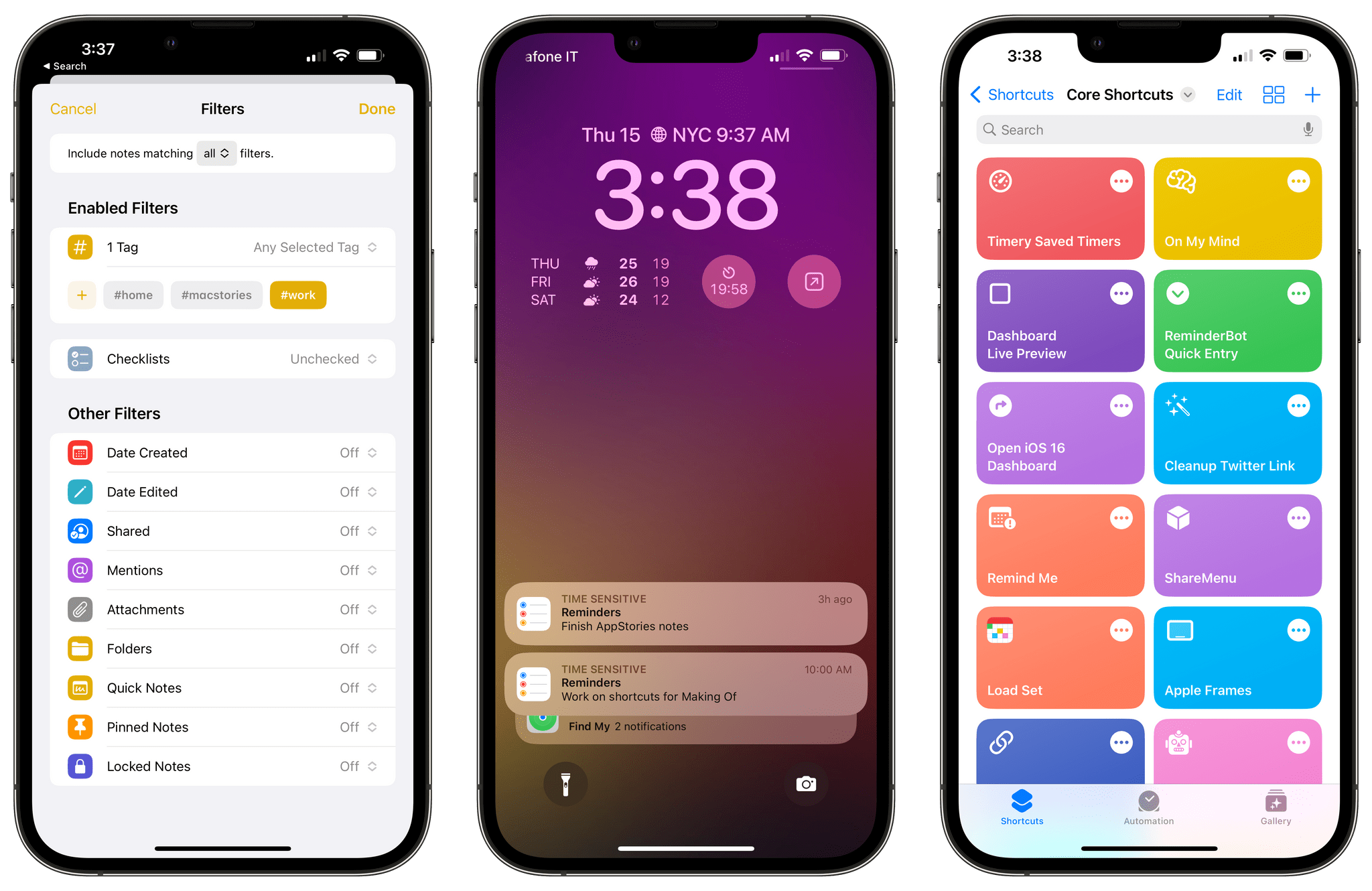
Lock Screen and Widgets
There’s not enough space for widgets on the Lock Screen. This is the big one for me. For now, there is a single horizontal strip for widgets on the Lock Screen. As a result, I find myself either having to choose between four widgets underneath the clock or constantly swapping between different Lock Screens. I’m not saying that Apple should fill the Lock Screen to the brim with widgets, but I think that, at the very least, a second row would help a lot.
Maybe not so many, but I really don’t understand why Apple didn’t do two at least *two* rows under the clock. One is too limiting. https://t.co/ps7nzAcL7e
— Federico Viticci (@viticci) September 14, 2022
You can’t customize the camera and flashlight buttons on the Lock Screen. In iOS 16, you can customize almost everything about the Lock Screen except the camera and flashlight buttons. This feels like an oversight at this point, and I hope we won’t have this problem anymore next year. My proposed solution: every button that you can normally find in Control Center should also have the ability to be “promoted” to the Lock Screen.
There should be an easier way to swipe through Lock Screens. Speaking of multiple Lock Screens: I wish it was easier to manually swipe through multiple Lock Screens during the day just like you can quickly flick through faces on Apple Watch. Perhaps a two-finger swipe gesture would help.
Custom Lock Screen colors should apply to all fonts on the Lock Screen. This is an odd limitation in an otherwise very well thought out feature. Custom Lock Screen colors do not apply to text and symbols in the iPhone status bar. I’m sure that millions of people will spend way more time than previously anticipated picking the font-color combo that’s just right for them. But having those colors not apply to the status bar and other elements of the Lock Screen feels wrong and makes those parts of the Lock Screen look out of place. I hope Apple fixes this soon.
Apple hasn’t made enough widgets for its own apps. I’ve felt this for the entire summer: Apple should have done more with its own widgets this year. Sure, some apps that do support Home Screen widgets aren’t well-suited for the Lock Screen, either because of technical limitations (a Photos widget wouldn’t look great) or because it wouldn’t bring much utility to a glanceable Lock Screen (would you use a Files widget there?). Still, several apps, features, and sizes that would absolutely make sense as Lock Screen widgets just aren’t there in iOS 16. Why are there no widgets for Music, Contacts, Shortcuts, Notes, or more sizes for Reminders widgets?
Home Screen widgets are still non-interactive. Home Screen widgets were initially pitched as “glanceable” widgets two years ago, but now we also have glanceable widgets on the Lock Screen. This is an anomaly. I think Lock Screen widgets are the ones that are meant to be glanceable; the Home Screen ones should be glanceable and interactive at the same time. Apple seems to know this on other platforms, so why not on iOS too?
Focus
Apple hasn’t built enough Focus Filters for its apps. What I said for Lock Screen widgets also applies to Focus Filters: I wish Apple had built more of them for their apps. I would have liked to see more controls for iMessage conversations (there’s no way to filter out pinned threads, for example) and filters for apps such as Reminders, Notes, Music, and Files. Given that the technology is based on App Intents, hopefully Apple will be able to add more app filters as time goes on just like they can with Shortcuts actions.
Shortcuts
Shortcuts continues to feel buggy and unreliable. I was hoping I’d no longer have to say this after last year’s SwiftUI rewrite, but I keep running into all sorts of UI glitches, crashes, and unexpected behaviors in the Shortcuts app. It’s gotten so bad for me lately, the app is getting in the way of shortcuts I need to create for Club MacStories members.
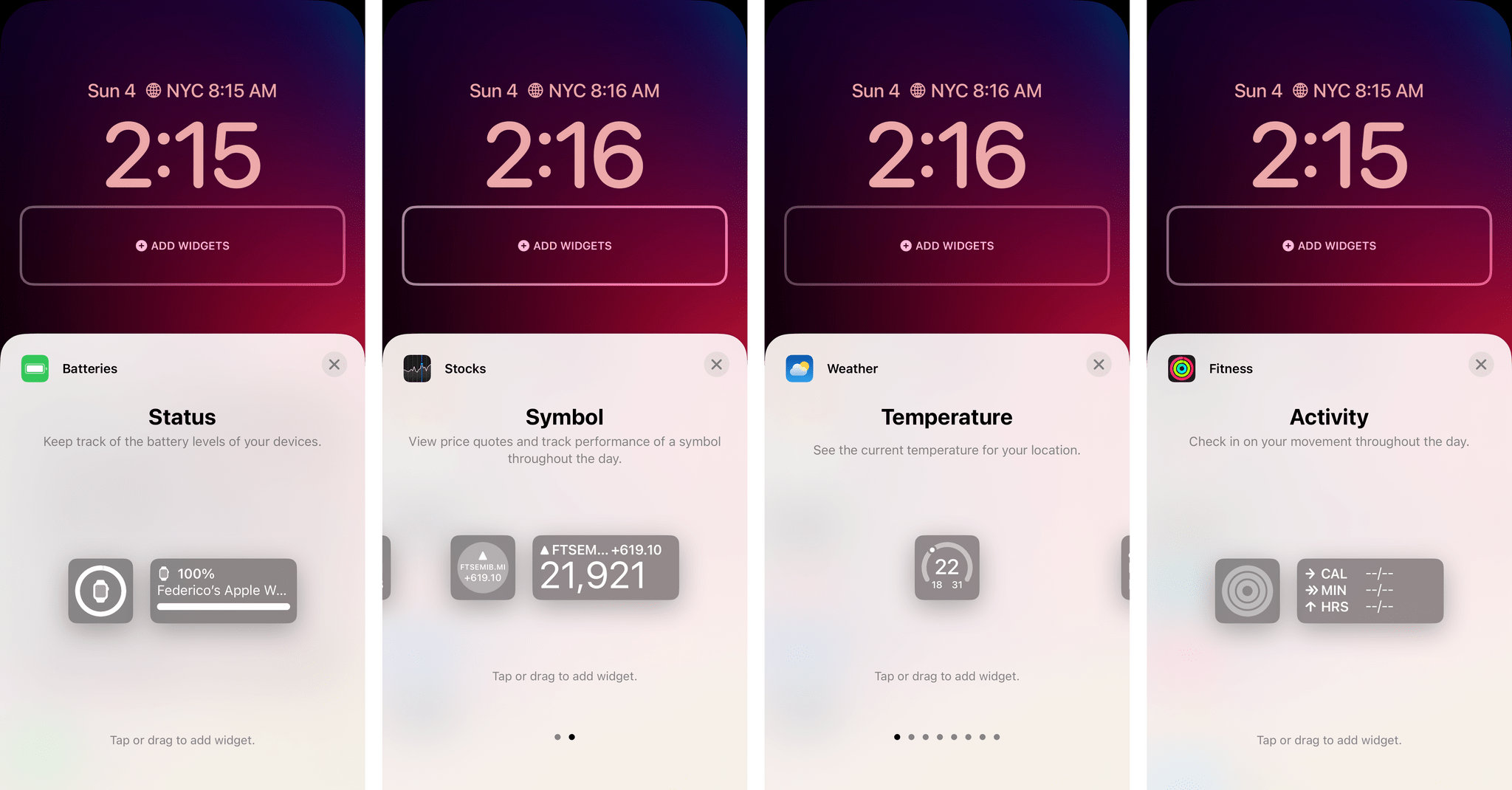
Generally speaking, the performance of the Shortcuts editor – the actual process of dragging and dropping actions – is, very frequently, abysmal: I constantly end up dropping actions where they’re not supposed to be, or freezing the editor, or seeing a weird UI glitch. Sometimes actions from apps don’t show up in Shortcuts unless I force-quit the app. Other times loading the action list takes more than 10 seconds and I’m left staring at a blank screen. Some actions (see more below) are just not working as intended.
Left: one day, I woke up and Shortcuts decided to throw some of my shortcuts outside of their folders. Right: the loading screen for actions I often see for several seconds.
This is unfortunate given how much I love Shortcuts, and I know that there are some really smart folks working at Apple on the Shortcuts team. But the truth is that Shortcuts’ stability and polish just aren’t up to Apple’s standards at this point.
The ‘Open Note’ action doesn’t work. Let me give you some specific examples. The ‘Open Note’ action still doesn’t support opening a note directly if it was passed from a ‘Find Notes’ action; the ‘Find Notes’ action still doesn’t support searching inside the Quick Notes folder either.
The ‘Delete Shortcuts’ action is unreliable. I was hoping this action would come in handy when combined with the ‘Shortcut’ variable type, which contains a property that returns the action count of a shortcut in iOS 16. By combining the ‘Get My Shortcuts’ action, the ‘Action Count’ property, and the new ‘Delete Shortcuts’ action, I thought I could create a shortcut to delete all shortcuts in my library that contained 0 actions. These are the shortcuts I create when I want to test something quickly, then I delete their actions, but forget to delete the shortcuts themselves. Unfortunately, the ‘Delete Shortcuts’ action doesn’t seem to accept a list of shortcuts saved in a variable, which is shortsighted.
There are still no third-party triggers for Shortcuts automations. I’s about time for personal automations to go beyond the usual set of triggers offered by Apple; there should be a developer API for third-party triggers in Shortcuts automations, and that’s not here this year either.
We need new shortcut colors and glyphs. Apple has a system-wide color picker now, and they’re using it everywhere in iOS 16. Why are we still limited to 15 colors in Shortcuts? And why is the app barely scratching the surface of the SF Symbols we could use as icons?
Notes
Notes needs Smart Folder filters for note titles and body text. Despite some very nice improvements to smart folders in Notes this year, you still can’t create filters that search for notes by title and body text. This is one of my favorite aspects of putting together smart searches via Dataview in Obsidian, and I’m a disappointed Apple didn’t have a native, visual answer for this in iOS 16’s Notes app.
Quick Note for iPhone is a misstep. Unlike its iPad counterpart, Quick Note for iPhone is a full-screen window that only lets you capture new quick notes and does not let you swipe through your existing quick notes.
This is wrong for a couple of reasons. First, as we’ve seen with Picture in Picture, the iPhone is perfectly capable of handling small, floating windows that you can drag around onscreen. What’s worse, however, is that the iPhone version of Quick Note was demoted to a “companion” utility that only lets you create new notes instead of letting you see your entire library of quick notes. Apple may have thought they were doing users a favor by simplifying Quick Note on iOS, but, in fact, it’s the opposite: with this limitation, they’re forcing users to accumulate a long list of quick notes and clean them up later.
Reminders
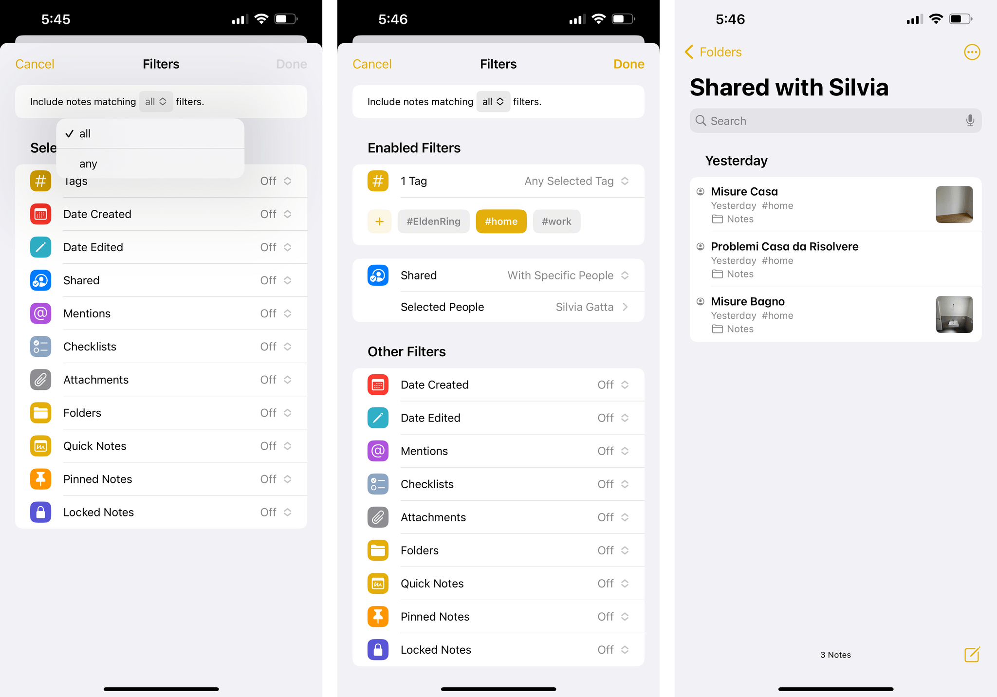
Reminders’ smart lists still need more flexibility. I love the work the Reminders team has been putting into the app for the past few years, but I still want more from its smart list functionality. For instance, you still cannot stack multiple filters of the same kind together; if you want to make a custom ‘Overdue + Tomorrow’ smart list that filters both reminders due today and due tomorrow, you can’t because you can’t add multiple ‘Date’ filters to the same smart list.
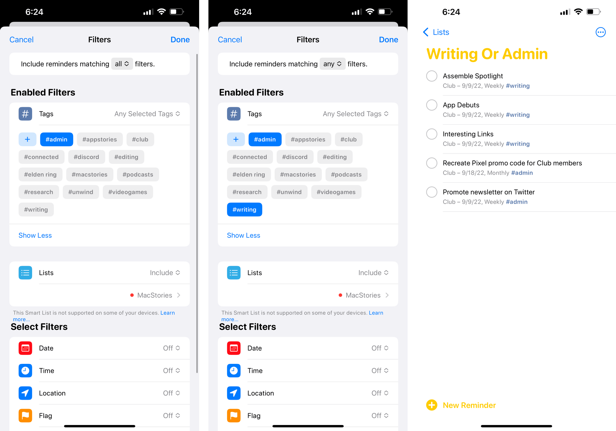
The most baffling omission, however, is in the new ‘List’ filter: you can only include or exclude one list at a time. While the corresponding filter in the Notes (‘Include/Exclude Selected Folders’) lets you choose multiple items at once, in Reminders you can’t select multiple lists in a filter. I don’t get it.
There’s no support for batch actions on selected tasks via a long-press. One of the best features of iOS 16 is the system-wide support for batch operations on selected files by long-pressing them. Alas, this is not supported in Reminders, where I would have liked to select multiple tasks at once and reschedule them from a context menu that appears with a long-press – consistent with the same action in Photos and Files.2
System
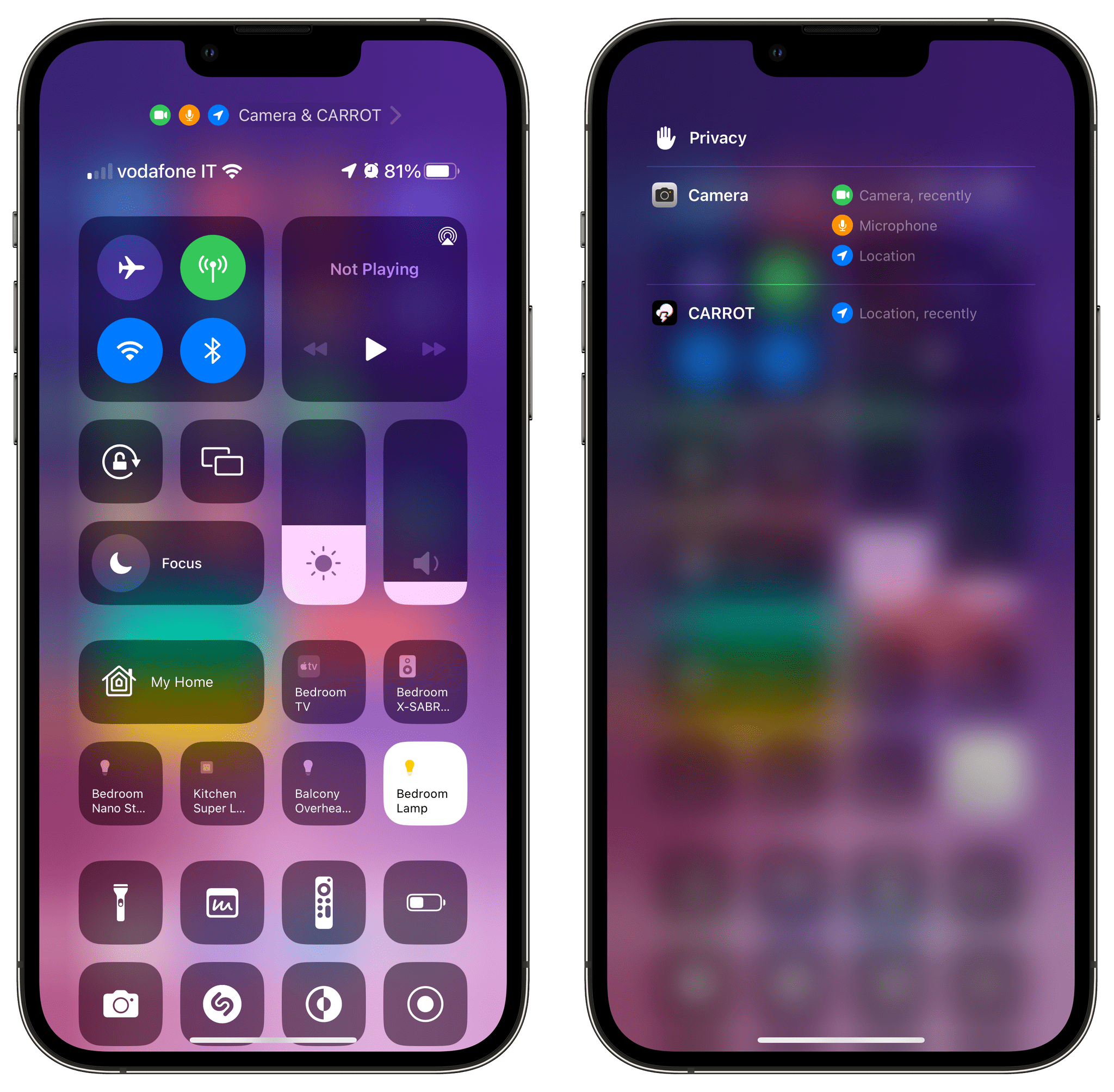
Control Center’s Privacy menu should be tappable. iOS 16’s Control Center shows you a handy breakdown of the apps and system features that recently used your location, camera, and microphone. I wish it was also possible to tap on the items listed in this screen to open their associated Privacy settings page.
Enough with the clipboard permission alerts. In iOS 16, Apple is cracking down on apps that automatically read the contents of your clipboard when you open them by displaying an alert whenever an app tries to access the clipboard without your consent, from which you can allow or deny access:
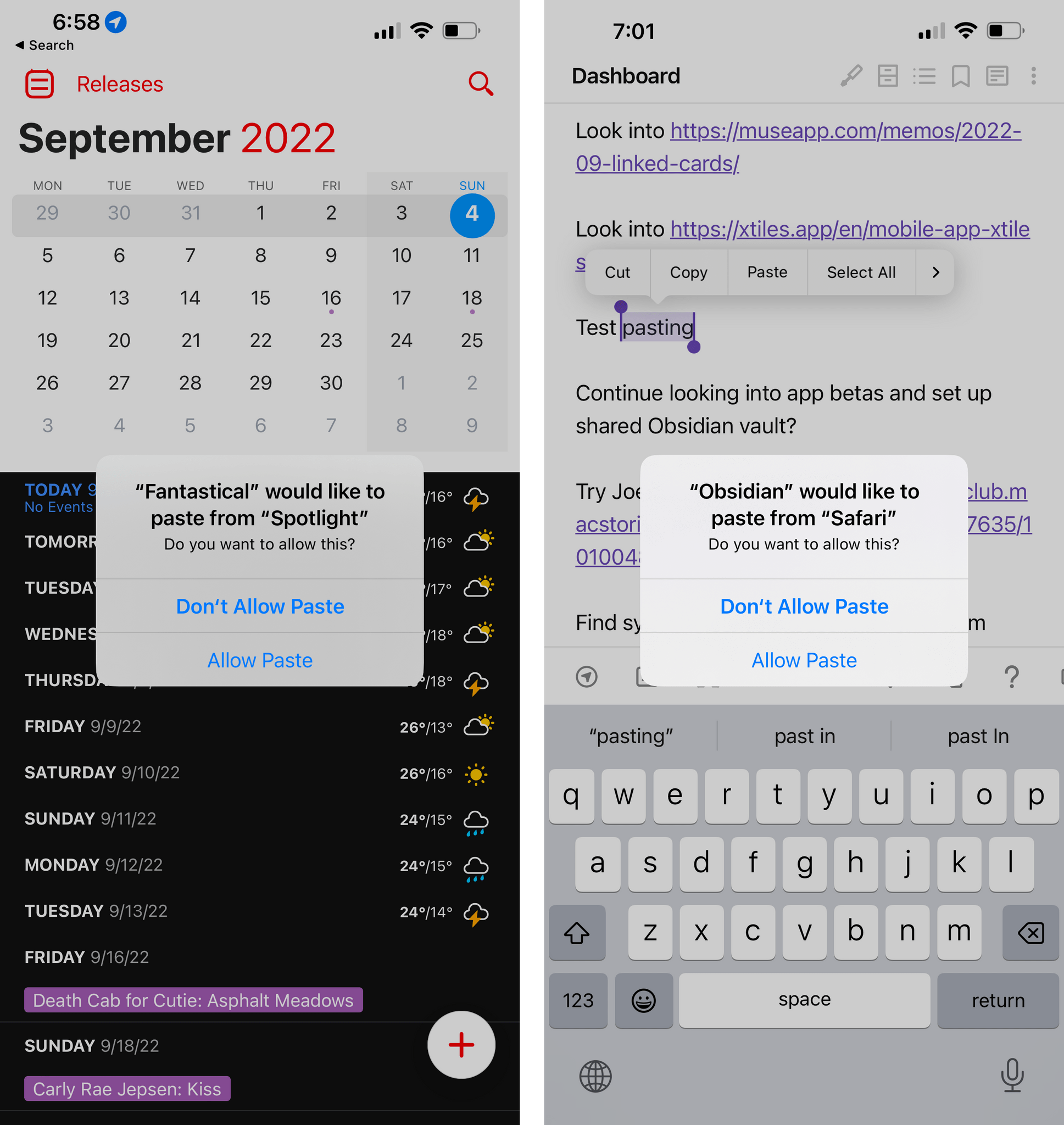
Now, I’m all in favor of Apple making tools to protect our privacy and ensuring that we always have control of our data, but in doing this, I should also note that Apple has made apps that had legitimate reasons to read the system clipboard more annoying to use – and less useful – in iOS 16. An app like Parcel, for example, could automatically read your clipboard and suggest adding a new delivery for an item if it found a valid tracking number in your clipboard. That process is not so seamless anymore in iOS 16, and the same is true for other apps that would offer to do something upon reading the clipboard, such as Fantastical (for dates) and Matter (for articles).
Apple recommends developers use a native ‘Paste’ button in lieu of automatic clipboard monitoring, but I disagree with their approach.
There should be an API to grant a specific app automatic, persistent clipboard access by authorizing it once. Instead, whether I’m using Matter or Obsidian (where all ‘paste’ commands trigger this alert over and over now), I feel like I’m constantly being punished by doing something I know, and I’m just annoyed by the alert at this point. I wish I could turn it off. Hopefully, with enough feedback, Apple will come up with a better solution for developers and users next year. The solution isn’t to punish users with incessant alerts: it’s to give developers new and modern clipboard APIs.
The battery percentage design needs another pass. If you decide to enable the Battery Percentage setting in Settings ⇾ Battery, you’ll get a new battery icon in the status bar where its current percentage value is displayed inside the battery icon. So far so good: it’s an approach that makes sense to save some space. The issue with Apple’s design is that the battery icon stays in a completely filled-in state even if the actual battery left is, say, 55%. So whether you’re at 100% or 55%, the battery icon will always look completely full. The battery’s “juice” will only change color and shape when power gets below 20%.
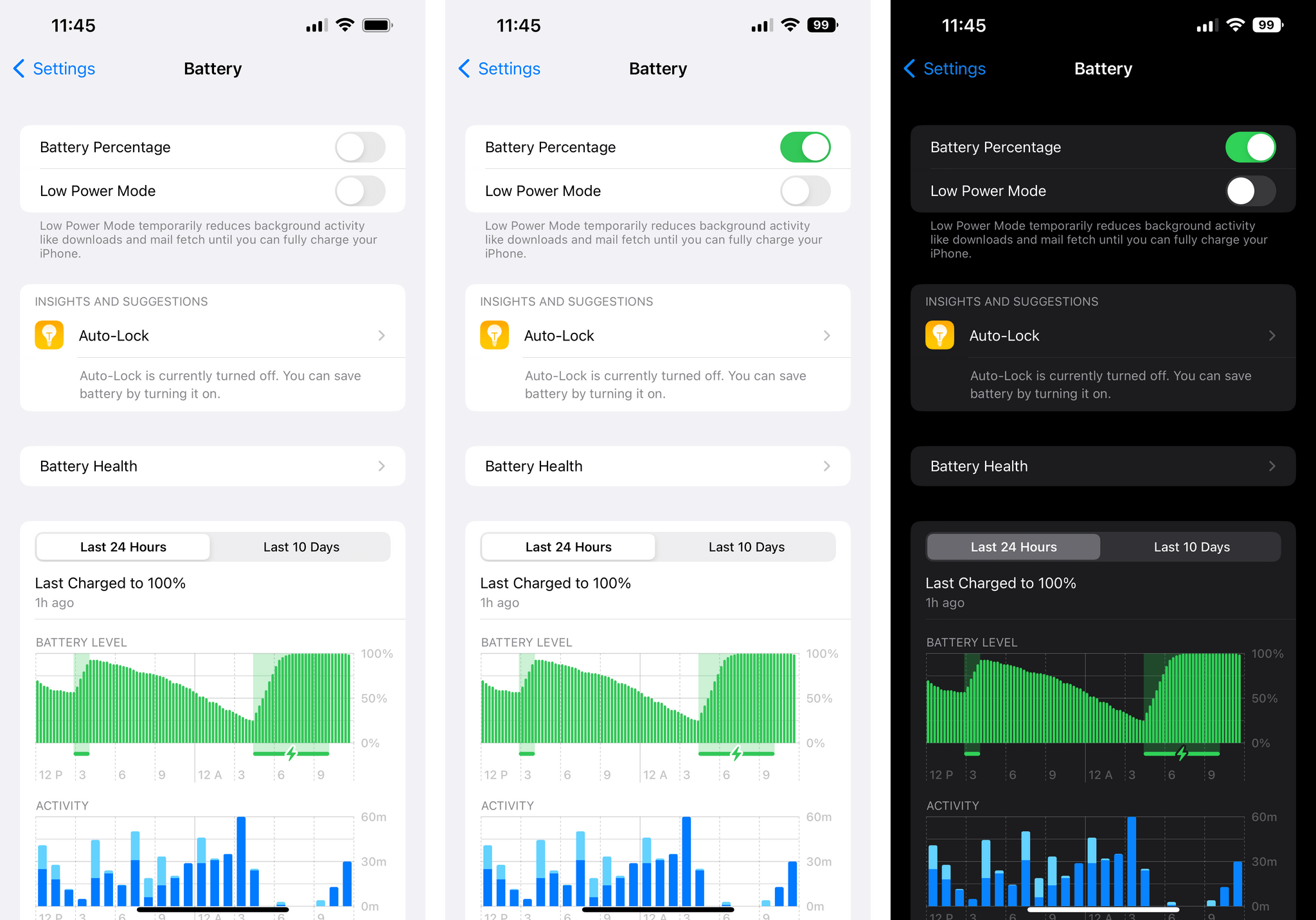
I find Apple’s design confusing: the battery glyph always says one thing, while the numeric value says another, which adds friction when trying to parse how much battery is left at a glance. There could have been several alternatives to this design, and I think Apple should revisit their take on battery percentage.
So these are the highlights of the things I don’t like in iOS 16 at the moment. Based on what I’ve seen so far, the recently released beta of iOS 16.1 doesn’t fix any of these, but given its potential launch in October, there’s probably still time for more tweaks and changes.
As I’ve explained in my review, iOS 16 is the most fun I’ve had with my iPhone in a while. That newfound sense of fun and discovery has only grown with the release of third-party apps optimized for iOS 16, which we’ve been covering for the entire week here at MacStories. You can expect more on this front; and, of course, stay tuned for my iPadOS 16 review next month.
- One of the One True Sons. ↩︎
- You can reschedule multiple reminders at once via a toolbar icon; I still would prefer to see Reminders adopt the new context menu system of iOS 16. ↩︎