For the past two weeks, I’ve been using the developer beta of iPadOS 14 on my 2018 12.9” iPad Pro – my main computer and production machine. Although I feel like it’s too early for me to offer a definitive assessment of iPadOS 14, I figured it’d be interesting to share some initial thoughts on the evolution of the iPad platform now that iPadOS 14 is available as a public beta as well. These are just some of the key takeaways and “core themes” I’ve been mulling over since WWDC; I plan to dig deeper into every aspect of iPadOS 14 in my annual iOS and iPadOS review in the fall.
A trait of iPadOS 14 that immediately stands out is how this year’s changes to the iPad experience do not come in the form of shiny new pro apps or reimagined multitasking. Apple didn’t showcase iPad-specific versions of Xcode, Final Cut, or Logic at WWDC, nor did they address longstanding criticisms related to how the iPad operates in multitasking and multiwindowing contexts. They didn’t, for instance, rethink the role of drag and drop as the sole mechanism to activate Split View or introduce new menus to manage multitasking. Instead, iPadOS 14 is all about refinements to the core iPad experience, with changes in the design department aimed at increasing information density, speeding up interactions by reducing taps and modality in apps, and taking better advantage of the iPad’s large canvas.
Rather than outright redesigning the iPad’s multitasking structure again, it feels like Apple wants to first ensure apps and other surrounding features can be more flexible and better prepared for whatever comes next. And to achieve this, the company has once again borrowed interaction principles from macOS and adapted them to the iPad’s modular computing nature.
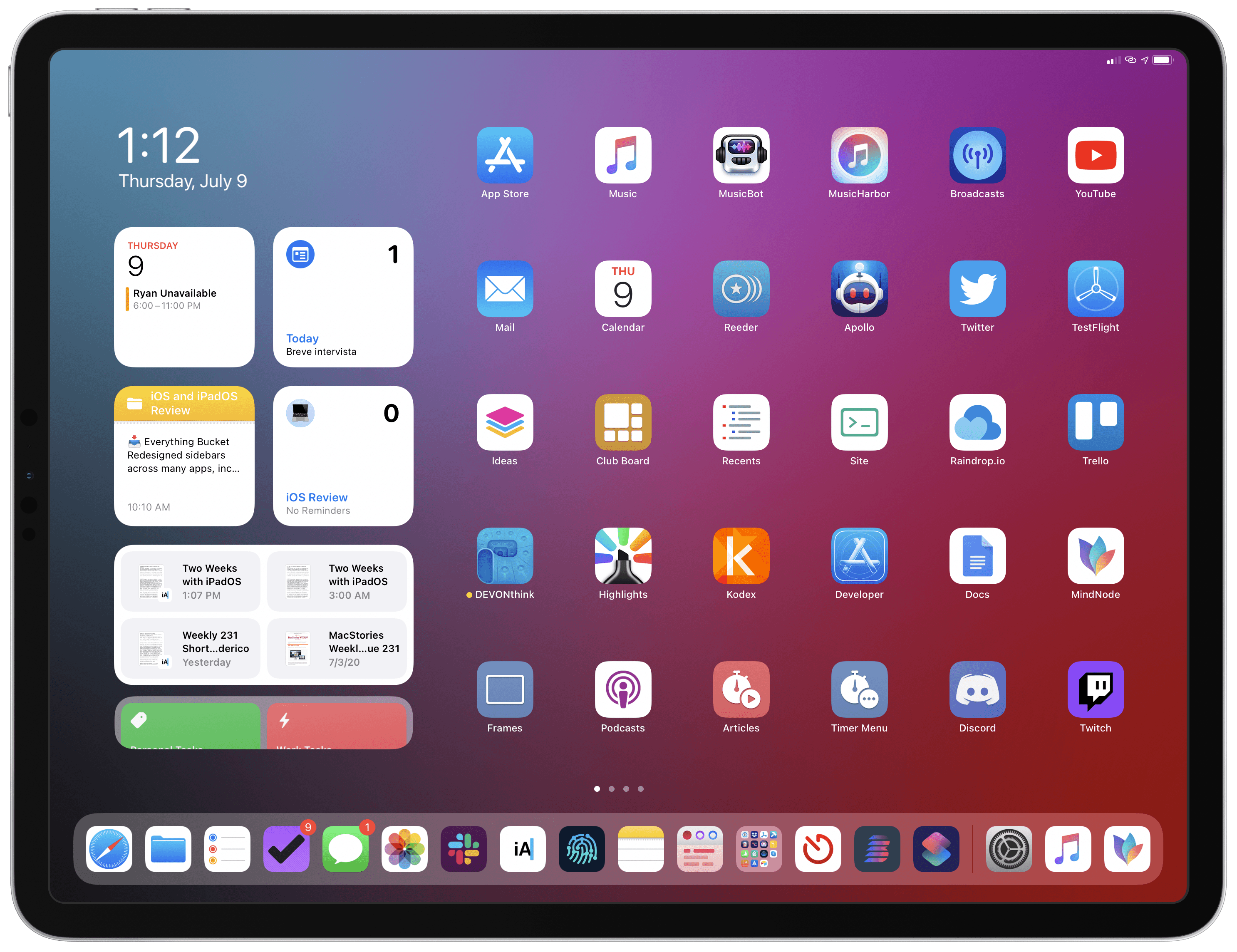
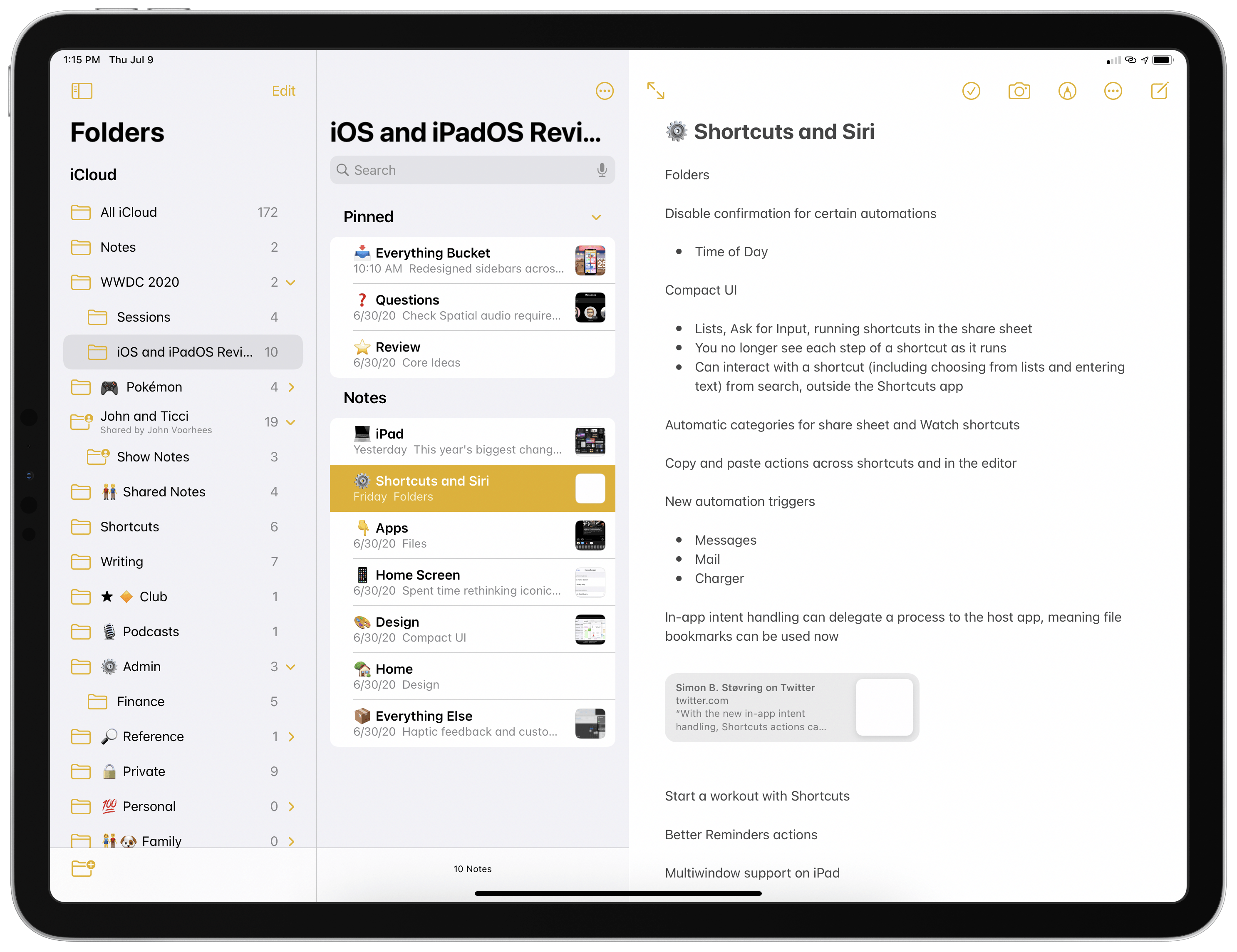
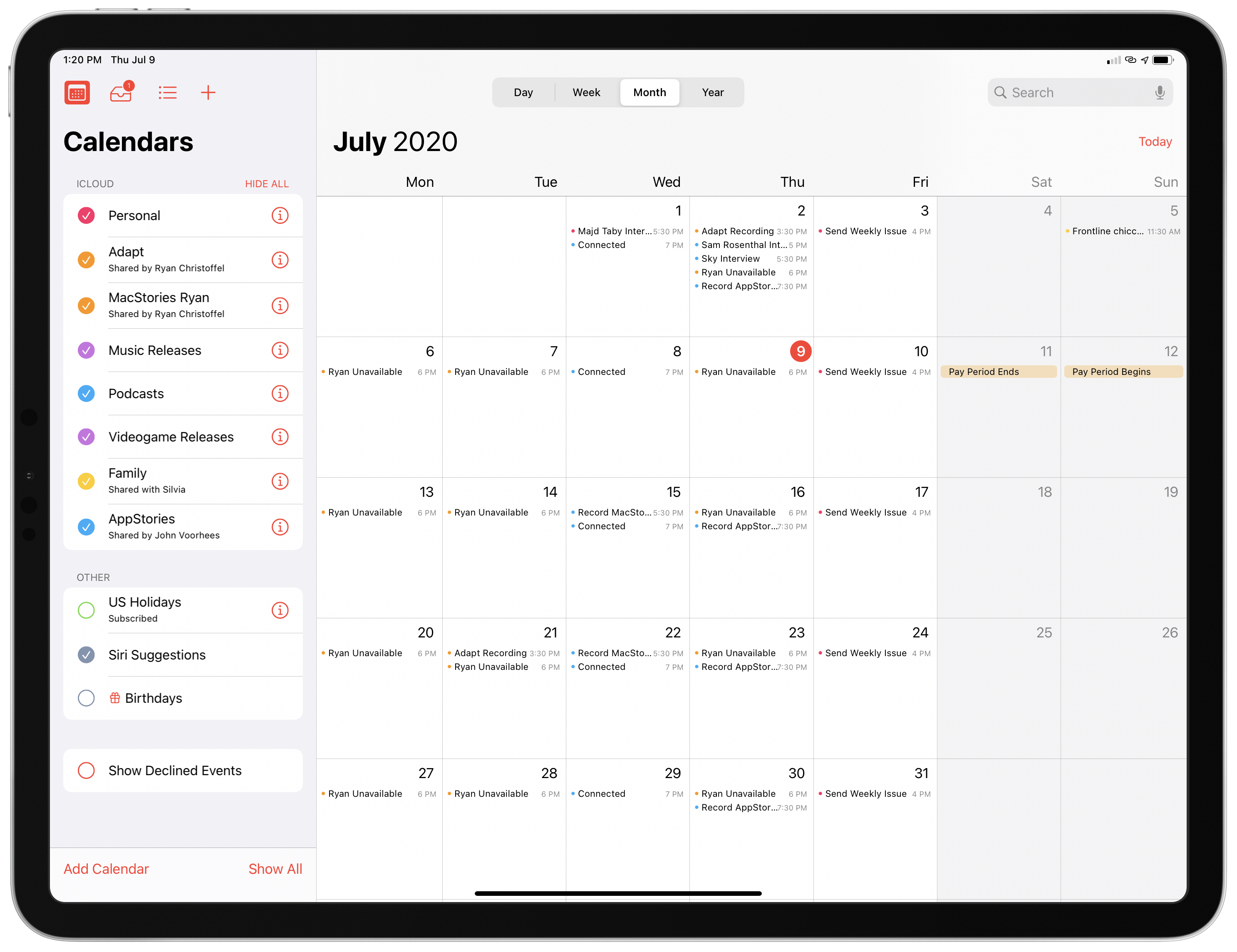
Nowhere is this more apparent than the new system sidebars – by far the standout addition to several built-in iPad apps in my experience with iPadOS 14. Apps like Photos, Music, Calendar, and Shortcuts sport a new three-column layout with a sidebar that dramatically simplifies navigation by putting different sections and functionalities just one click or tap away. The sidebar is a native iPadOS element available for third-party developers to add to their apps; Notes and Files, which featured a sidebar before, have also been updated to use the new sidebar provided by iPadOS 14, along with its system behaviors (which include collapsible sections, automatic support for size classes, and integration with gestures for quick dismissal).
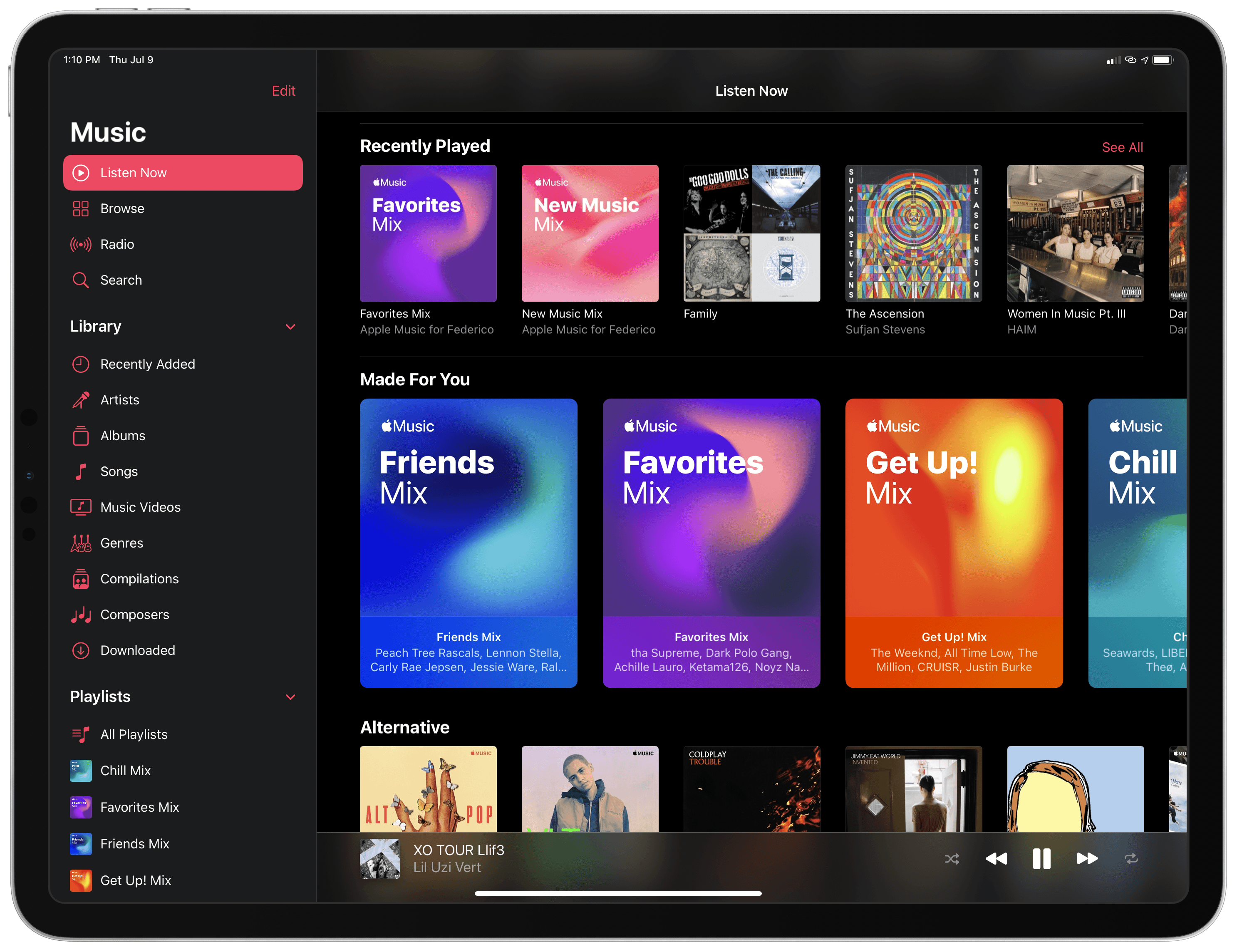
By itself, a three-column layout with a sidebar is not a groundbreaking invention: desktop apps (and several third-party iPad apps) have offered one for years now. What’s important in the context of iPadOS 14, however, is how Apple, by endorsing a specific approach to laying out and interacting with iPad apps, is signifying a shift in the platform’s role that’s now more tipped toward the Mac end of the computing spectrum rather than the iPhone’s – something we saw coming after last year’s iPadOS 13 and which was further highlighted by the introduction of the Magic Keyboard and system pointer a few months ago.
Here’s how I concluded my iOS and iPadOS 13 review last September:
By introducing iPadOS, Apple is selling us a bold future, one where the iPad can learn from the Mac’s lessons and play co-protagonist alongside the iPhone. And taken at face value, iPadOS delivers on what Apple promised back in June: more than any other iOS update before, iPadOS 13 has freed me from the constraints of desktop computing, turning my iPad experience into something that is neither iOS nor macOS, but different, audacious, and empowering.
As the curtain closes on the iPad’s first decade, whatever the future may hold, Apple has decided it’s time for the tablet to grow up, and is letting the iPad embark on its own adventure. Inspired by the Mac, firmly grounded in iOS’ tradition, and unafraid of what’s next.
Even more than last year, I believe that “inspired by the Mac” is the lens through which iPadOS 14 is best examined.
By flattening navigation in Music and Photos with the addition of a sidebar in iPadOS 14, Apple has made reaching sections such as specific playlists or albums noticeably faster; in Calendar, hiding events from specific calendars now only requires a single click thanks to the sidebar, which also gets rid of the modality typically involved with popovers – changes you make in the sidebar are instantly reflected in the main content area on the right side of the screen. In Shortcuts, the sidebar is the natural location for folders, which power users of the app have been requesting for years.
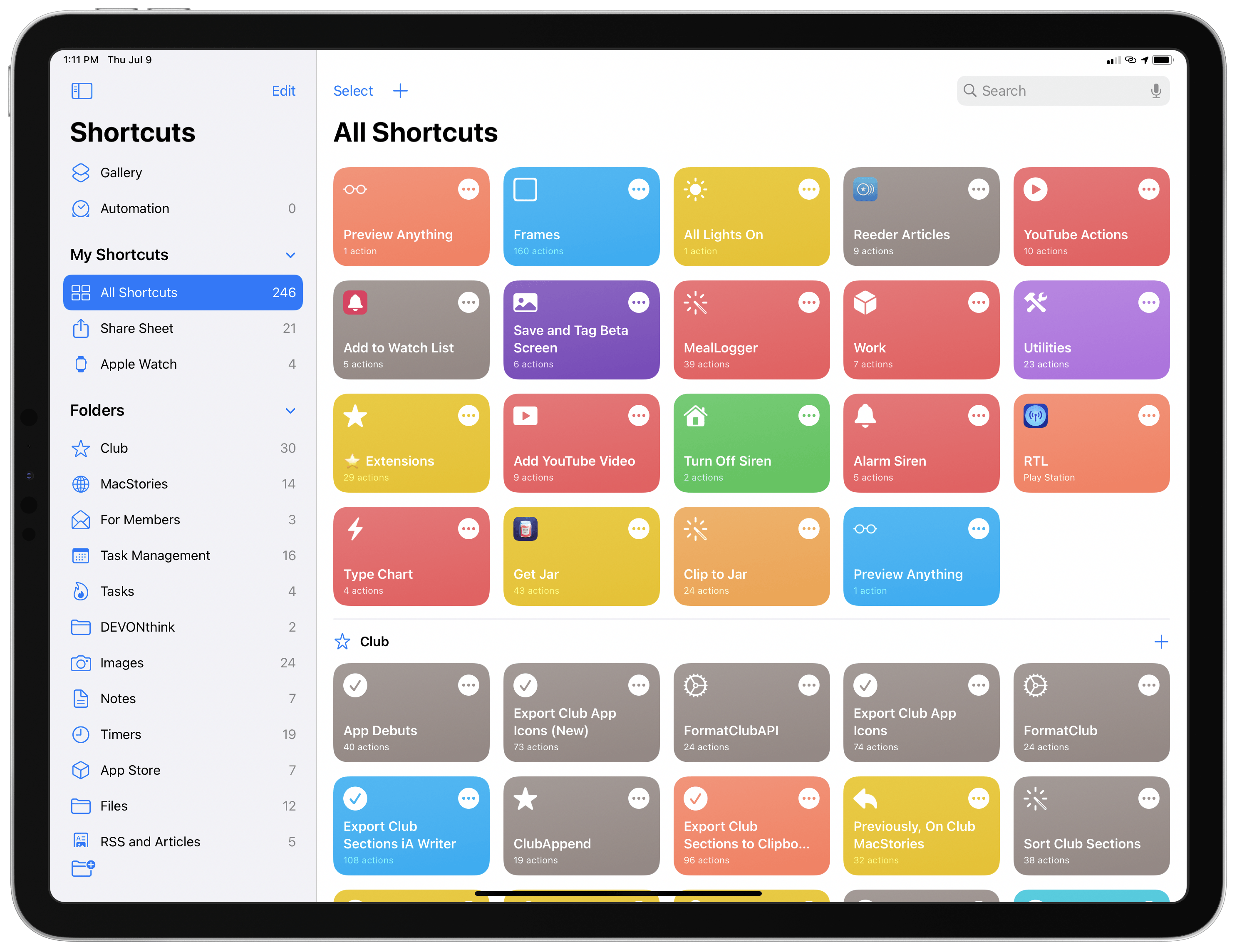
Folders have finally come to Shortcuts in iOS and iPadOS 14; on iPad, folders are available in the app’s new sidebar.
After using iPadOS 14 for the past couple weeks, I think that desktop-like app layouts featuring sidebars and multiple columns simply make sense for a device that is often used in landscape, most likely with an external keyboard attached. The three-column app layout with a sidebar on the left and two columns next to it is also ideal for the Magic Keyboard since you can quickly reach any navigation element as well as swipe columns away from the trackpad. I fully expect third-party developers to follow Apple’s lead here and move away from tab bars and iPhone-based layouts to embrace the company’s new guidelines in iPadOS 14.1 As I mentioned several times in my iOS reviews before, it’s okay to solve problems with solutions that the Mac pioneered decades ago; in this case, iPadOS 14’s multi-column layout is an effective solution to the issue of too many iPad apps still feeling like blown-up versions of their iPhone counterparts.
I also think it’s important to highlight how Apple isn’t moving away from the iPad’s touch-first nature. If anything, iPadOS 14 shows how the company is doubling down on the idea of touch and external inputs being able to coexist on iPad.
While the sidebar and new UI elements falling under the “made for iPad” marketing umbrella obviously took a page from macOS, Apple rethought and modernized them for touch and the iPad’s unique multi-input model. This, I believe, is the driving force behind iPadOS at Apple today: certain features may have originated on the Mac years ago, but in bringing them to iPadOS, Apple always accounts for the fact that iPad supports a variety of direct and indirect inputs, multitasking conditions, and hardware configurations. They’re old ideas, but they’ve been refreshed and simplified for a new kind of computing environment.
On the surface, it’s no surprise that iPadOS 14 is gaining sidebars, multi-column app layouts, and new toolbar menus: those features perfectly complement a device that can now be used with a multitouch trackpad. Clicking buttons in sidebars or choosing an option from a pull-down menu feels natural with the Magic Keyboard; it takes minimal adjustment coming from iPadOS 13. However, these functionalities are not exclusive to the Magic Keyboard and pointer: you can swipe with your finger from the left edge of the screen to invoke the sidebar when it’s hidden; pull-down menus (which replace action sheets and other modal menus in iOS and iPadOS 14) have been modeled after last year’s context menus, which work just as well with touch (they support haptic feedback, for example) as they do with the pointer and trackpad. And, of course, sidebars and three-column layouts (based on the new UISplitViewController API) work alongside Split View and Slide Over thanks to iPadOS’ adaptive layout, which automatically resizes and reflows content depending on how many apps are shown onscreen.
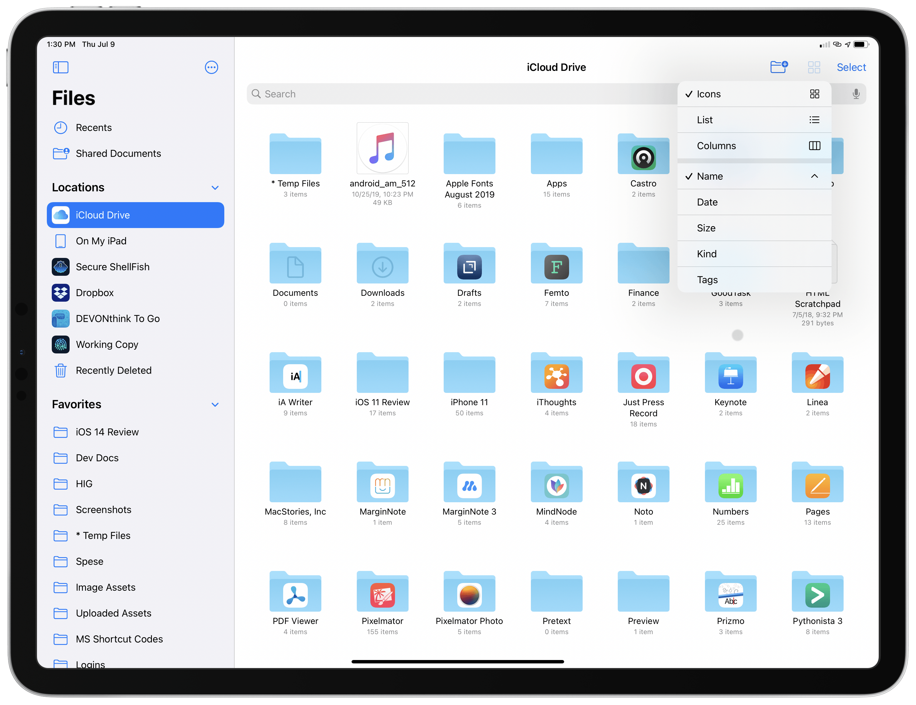
In iPadOS 14, Files features a more compact grid and surfaces common actions via the new pull-down menus.
Looking ahead at iPadOS 14 and the platform’s next steps, I expect Apple to continue pushing down this road of interactions that are designed both for touch and keyboard/pointer input. Starting with iPadOS 13.4, and even more so with iPadOS 14, it feels like Apple is acutely aware of the iPad’s modular nature, and different teams are working to support multi-input scenarios as seamlessly as possible.
Alas, this is also why certain issues stick out even more when this newfound approach isn’t followed.
The new universal Search in iPadOS (designed after the Mac’s Spotlight and appearing as a floating search bar in the middle of the screen) is a fantastic improvement over the old, full-screen Search of iPadOS 13; however, there’s no way to invoke Search inside apps without an external keyboard – you have to go back to the Home Screen and swipe down to activate it.
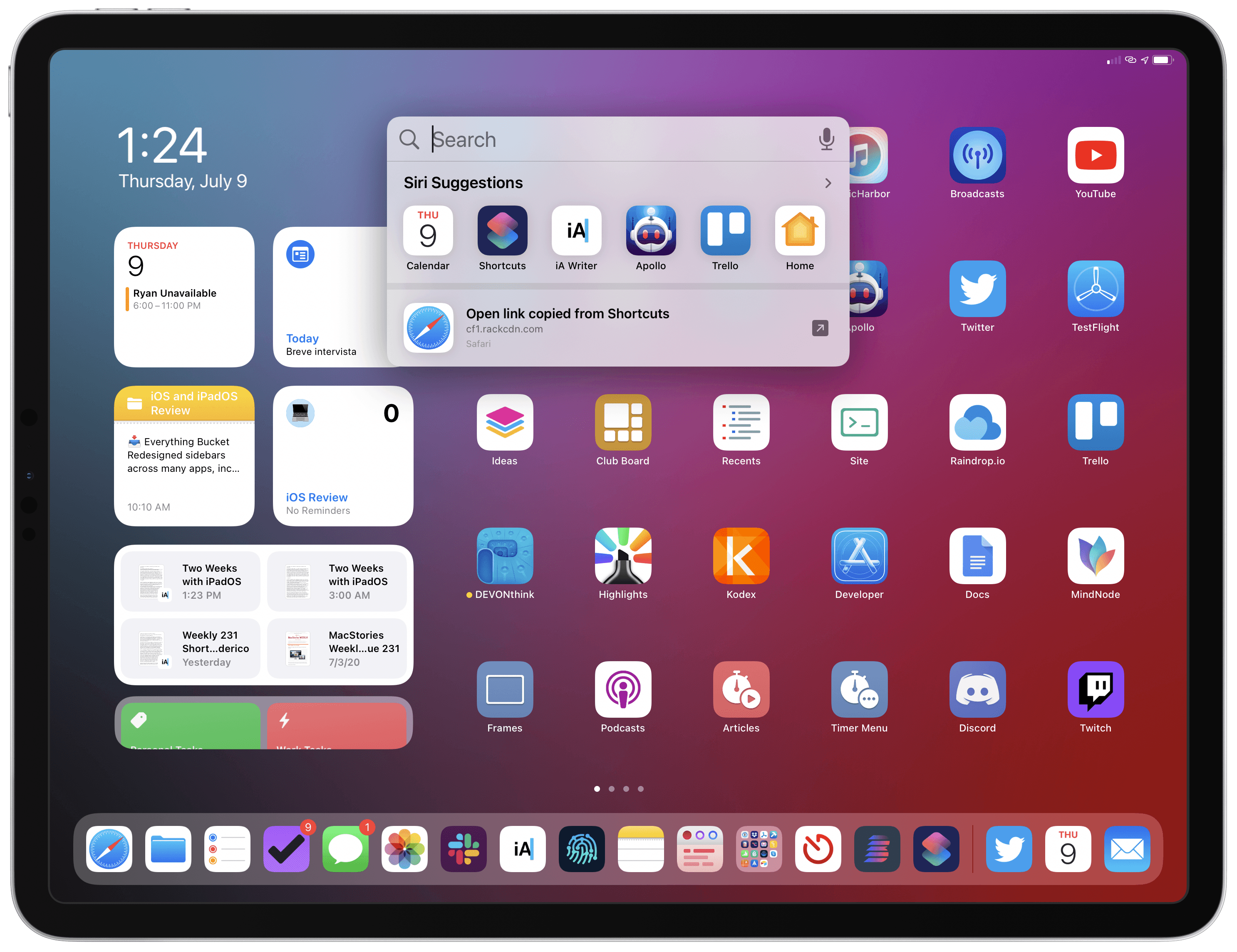
The new Search feature in iPadOS 14. Unfortunately, it’s still impossible to activate Search inside apps if you’re not using an external keyboard.
Similarly, while I don’t think Split View and Slide Over are the interaction disaster other folks paint them to be, they were designed for touch during the iPad era preceding the Magic Keyboard and pointer; as a result, it’s still fairly awkward to operate multitasking via the trackpad and keyboard in iPadOS 14, which brings no meaningful improvements to Split View and Slide Over management when you’re not touching the screen. If ever there was a solid case against the current implementation of Split View and Slide Over, their lackluster support for the keyboard and trackpad in iPadOS 14 is it.
Apple’s challenge for the future of iPadOS is to rid the platform of features that are only optimized for one of the device’s modes. At this point, it’s evident that any modern iPadOS app needs to feel great both when used with touch and the keyboard-trackpad combo – a unique problem Apple never faced in any of their other OSes before. The changes in iPadOS 14, while not revolutionary when considered in isolation, are part of this bigger narrative, and they’re paving the way for a redefinition of the iPad app ecosystem, powered by an OS built around modularity and multiple interaction methods.
My experience with iPadOS 14 over the past few weeks suggests that while deeper system changes may be awaiting us next year, this year’s update has a chance to put iPad apps on a new trajectory, resulting in a more versatile, desktop-inspired but still uniquely-iPad experience. As usual, I’ll check back on this in my annual iOS and iPadOS review later this year.
- From Apple’s Human Interface Guidelines: “Use a sidebar for quick navigation to the key parts of the app or top-level collections of content like folders and playlists.” ↩︎