No single feature of the iOS 14 betas has had as immediate an impact on my daily iPhone use as Home screen widgets. Together with the App Library, the features can radically change the way apps are organized and accessed by everyone. Users don’t have to use widgets or the App Library, but they’ve been designed to feel familiar and inviting, echoing the iPhone’s grid layout, folders, and search systems. The result is a deft balancing act that gently introduces the iPhone Home screen’s most significant makeover since it was launched, which I think will be a big hit with users and developers alike.
Widgets’ impact is less pronounced on the iPad, where their placement is less flexible, and there is no App Library. Widgets can’t do quite as much in iOS and iPadOS 14 betas as they can under iOS 13 either. Those are fairly significant caveats depending on how you currently use widgets and should be kept in mind, but it’s also worth remembering that this is the first public beta release. There are still many weeks before iOS and iPadOS 14 will be released, and users’ feedback could influence what the final implementation of widgets looks like.
Despite the current limitations, widgets have profoundly changed the way I use my iPhone and have the potential to do the same on the iPad. The impact surprised me because, after two and half weeks on the developer betas, the only widgets I’ve tried so far are based on Apple’s system apps. As a result, I wanted to share my first impressions and thoughts on widgets, the App Library, and how I’m using both on the iPhone and iPad. I also thought it would be fun to show off some of the ideas being explored by third-party developers, which I’m excited to try soon.
How Widgets and the App Library Work
Like many of the advanced features added to iOS and iPadOS in recent years, widgets and the App Library are optional. You can continue to use your existing layout of iPhone and iPad Home screens if you would like. Still, because both features are readily discoverable in what Craig Federighi described as ‘Jiggle Mode’ during the WWDC keynote and the Today view, I expect a lot of users will give them a try.
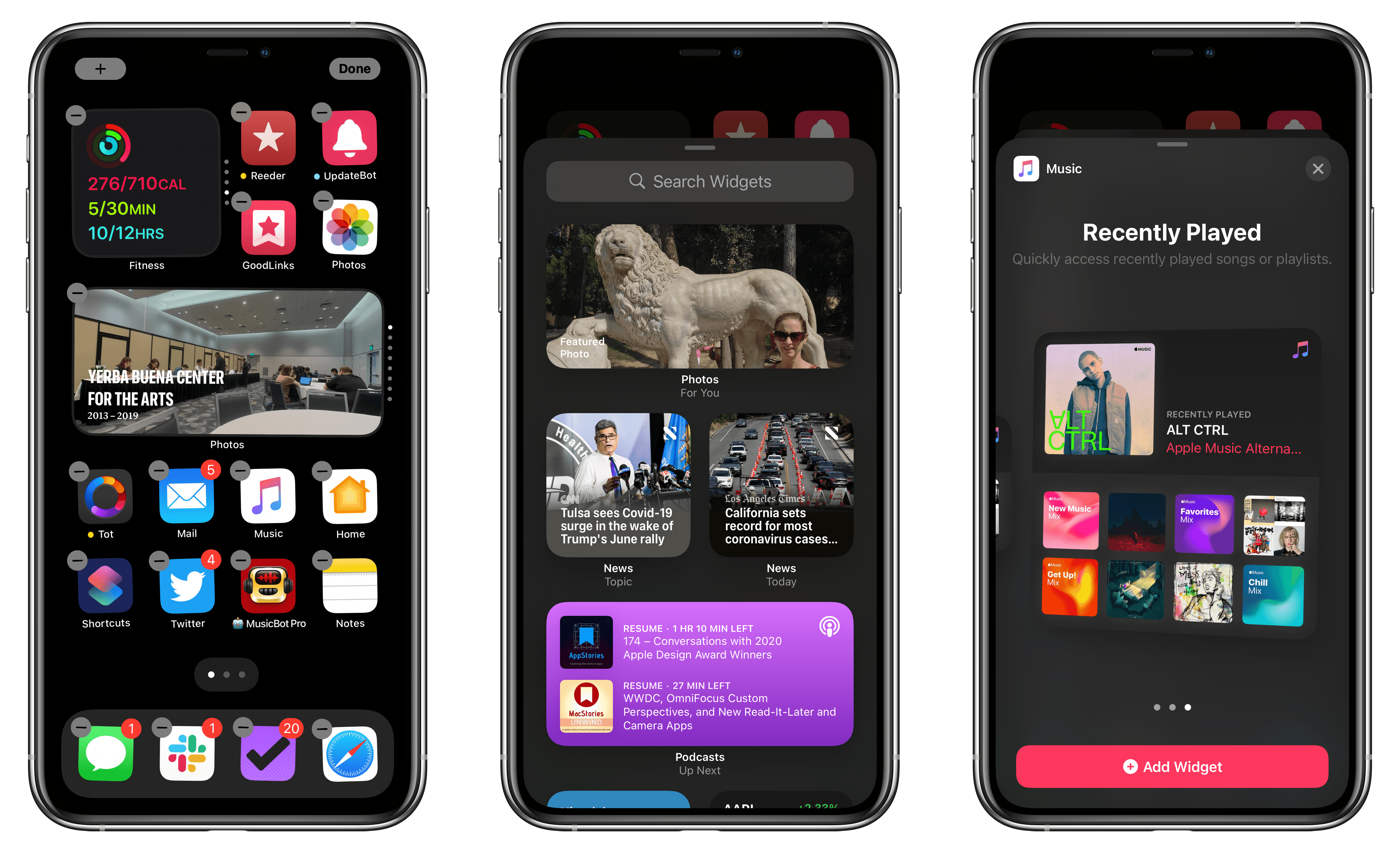
In Jiggle Mode (aka Edit Home Screen mode), you can rearrange and delete apps as in iOS and iPadOS 13. However, there’s a new plus button in the top left corner of the screen that opens a gallery of available widgets. Until third-party developers release widgets this fall, the gallery is limited to showing off widgets for most of Apple’s built-in system apps, plus a Smart Stack option that builds a stack of widgets based on your app usage. From this mode, you can also tap the page indicator dots at the bottom of the Home screen to activate the App Library and hide Home screens.
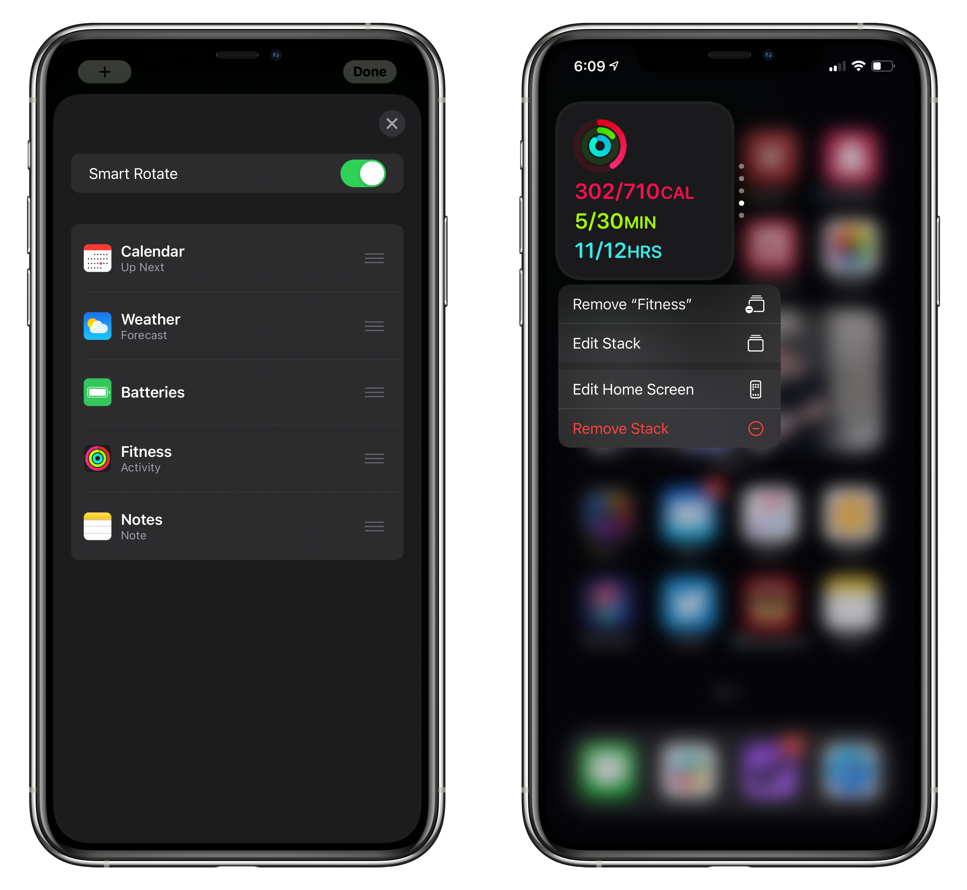
Widgets come in three sizes, which take up the space of four, eight, or sixteen app icons. On the iPhone, widgets can be placed on any Home screen or in the Today view to the left of the first Home screen. On the iPad, widgets are limited to the Today view column on the left side of your first Home screen. Widgets can be manually stacked on top of each other to conserve space. A quick vertical swipe cycles through a stack of widgets, though they also rotate periodically based on your habits if you turn Smart Rotate on in the stack’s settings.
The different widget sizes come with the sorts of trade-offs you’d expect. Bigger widgets dominate more of the screen to the exclusion of other widgets or, on the iPhone, apps. However, larger widgets can display more data and offer more options.
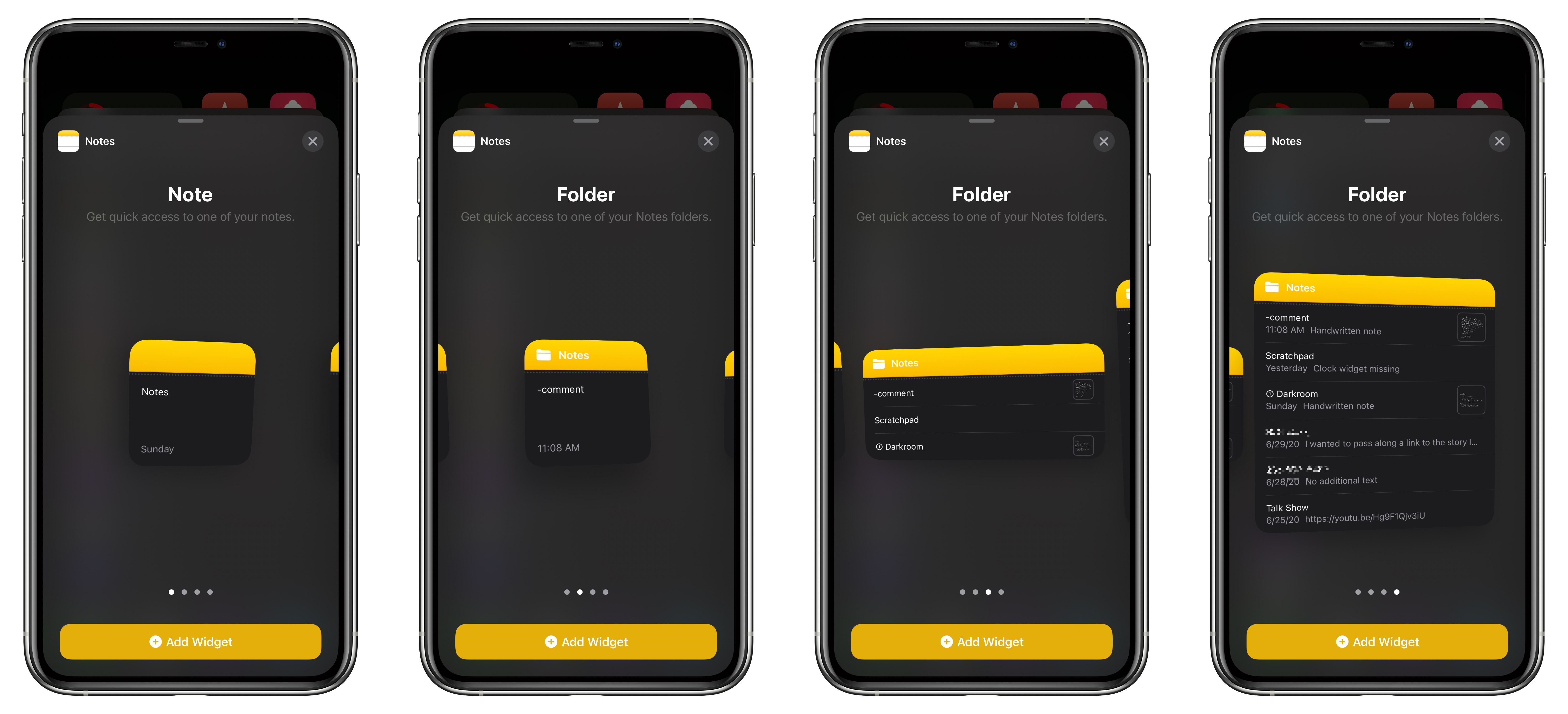
For some widgets, what’s displayed can be edited too. For instance, the small Notes widget can point to any single note in the app no matter how buried in a folder, while the larger variants can display the most recently edited notes in a particular folder.
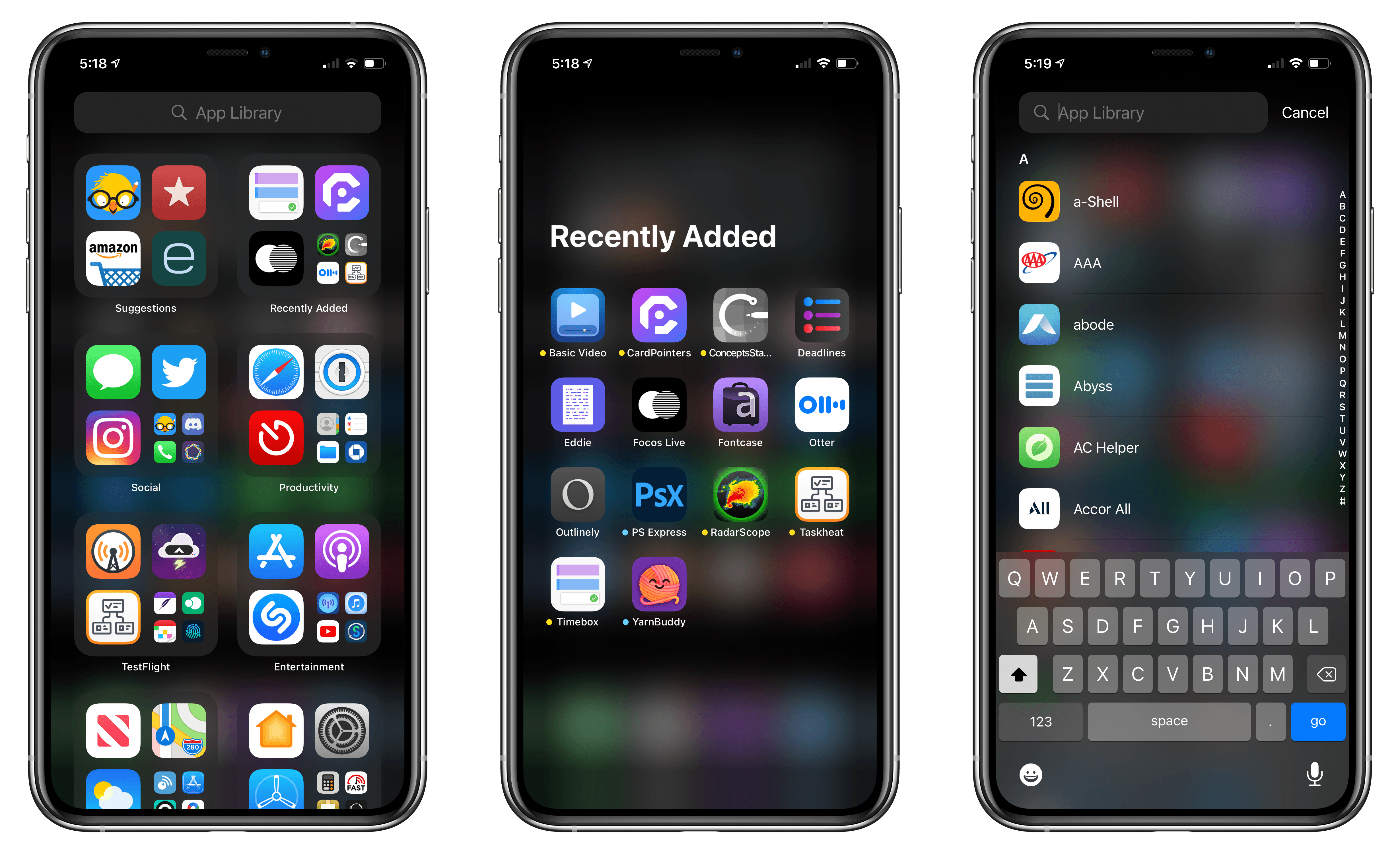
When you tap the pagination indicator at the bottom of the screen from Edit Home Screen mode, thumbnails of your Home screens appear that can be hidden by deselecting them. Apps on those screens are added to the App Library, which automatically organizes your apps into categories.
Getting to the App Library works just like the Today view but in the opposite direction. Swiping left from your last Home screen pulls the App Library into view as an overlay that sits on top of your last Home screen. The top two spots in the App Library are reserved for Suggestions and Recently Added, which evolve based on the apps iOS anticipates you’ll want to use and your recent downloads. The remaining categories include things like Social, Productivity, Entertainment, Utilities, and Games. There’s also an omnipresent search field at the top of the App Library, and if you pull down on the App Library, it turns into an alphabetical list that can be scrolled quickly with the letter index on the side of the screen.
The technical details underlying widgets are fascinating. They use SwiftUI to optimize performance and battery life by creating a flattened representation of the widget that can be rendered to the Home screen asynchronously on the GPU. The architecture makes running a widget more like presenting an image than running an app, but it’s also more than that as Apple engineer Eliza Block explained on the Swift by Sundell podcast during WWDC.
Although widgets can no longer accept user input using traditional UIKit controls like the calculator buttons in PCalc or the timer toggles in Timery, they still include an element of interactivity. A good example is the Music widget. The medium and large versions display a grid of recently played albums and playlists, and tapping on one opens the Music app to that album or playlist. The feature relies on Universal Links, which developers have been able to use for quite a while to deep link to content and views inside their apps. It’s a clever system that I expect will also serve the purpose of exposing a lot of developers to SwiftUI for the first time.
My Widget Setup
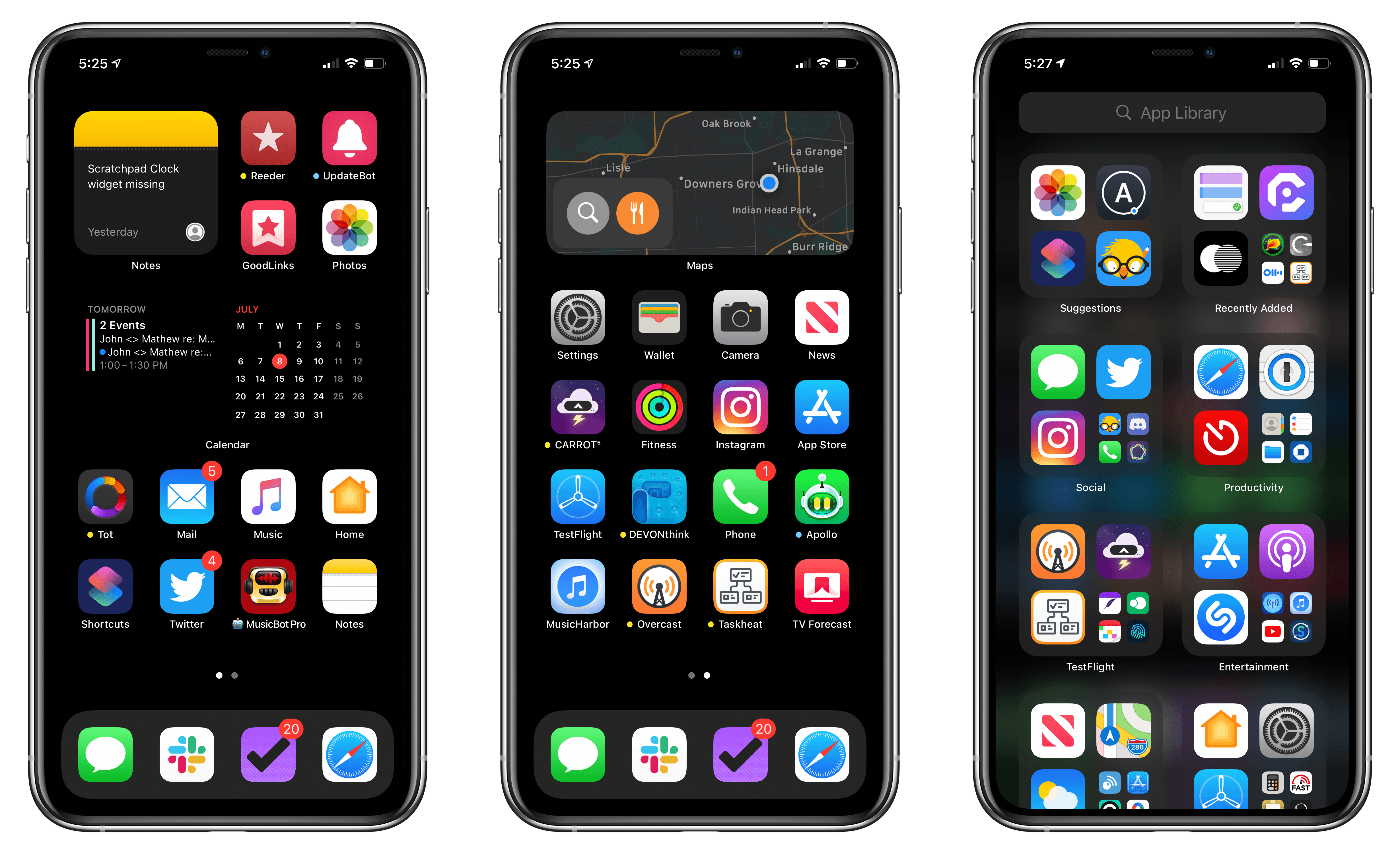
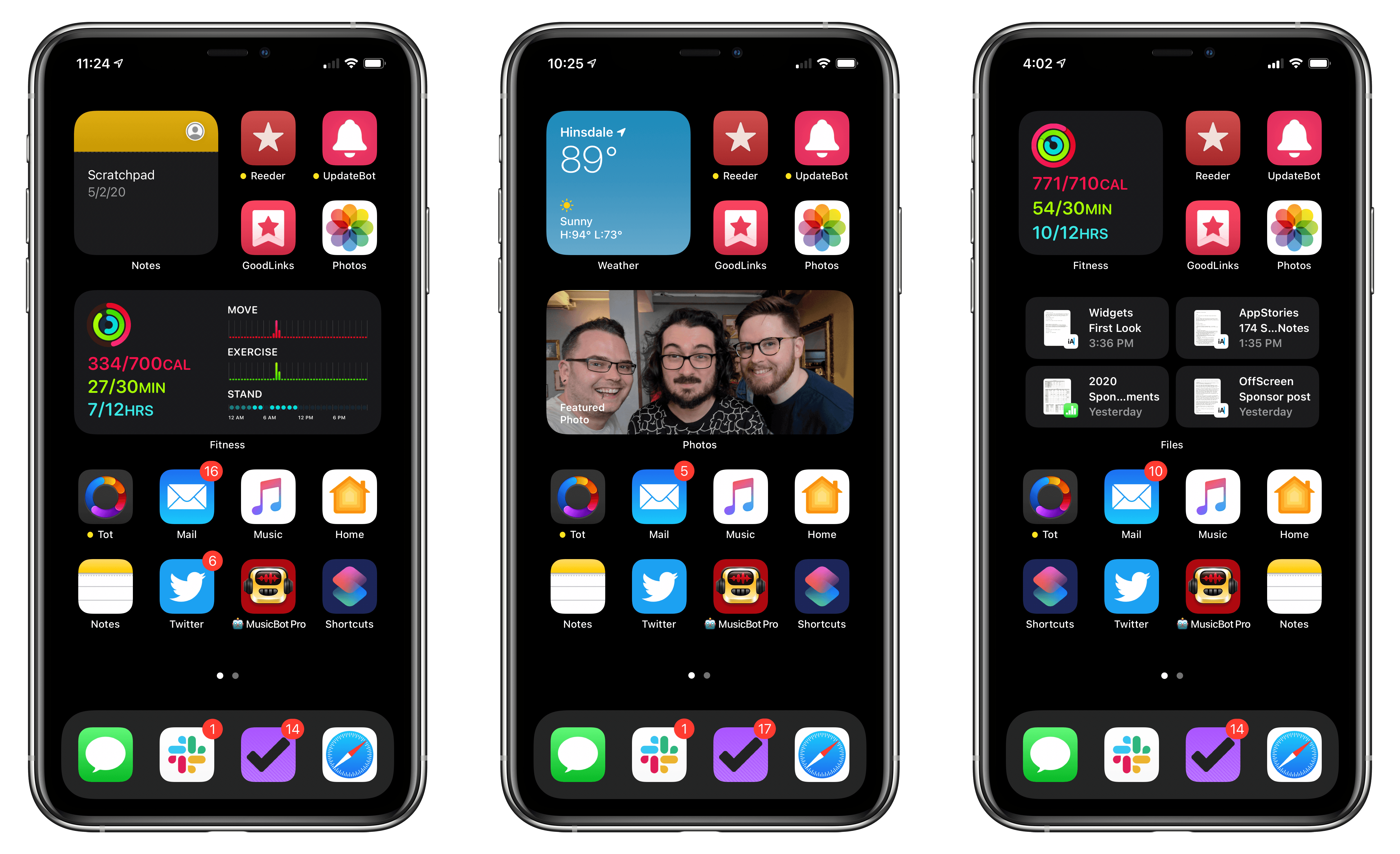
When I started experimenting with widgets, I was skeptical that I would be willing to sacrifice app slots to widgets on my first Home screen, which was already crowded with apps I use every day. Two things convinced me to add a small and medium widget to my first Home, eliminating a dozen app icons in the process.
By far, the most important factor has been stacks. Both widget spots on my first Home screen are stacks of multiple widgets. The small widget includes Weather, Battery, Fitness (formerly, Activity), Notes, and Calendar. The medium widget includes Recently Played music, a Notes folder, Shortcuts, Siri Suggestions, Photos, News, Files, and Calendar. By stacking widgets and turning on Smart Rotate, the one I want is often already displayed thanks to the smarts built into iOS, or it’s only a couple of swipes away.
The second factor in making widgets work was recognizing how many of the apps I use on my iPhone involve quick checks of things like the weather, my activity rings, and my upcoming appointments. Adding those apps to stacks freed up a lot of room on my Home Screen. The apps are still available by tapping on their widgets or using search, but they are far more useful as widgets that deliver focused information of my choosing.
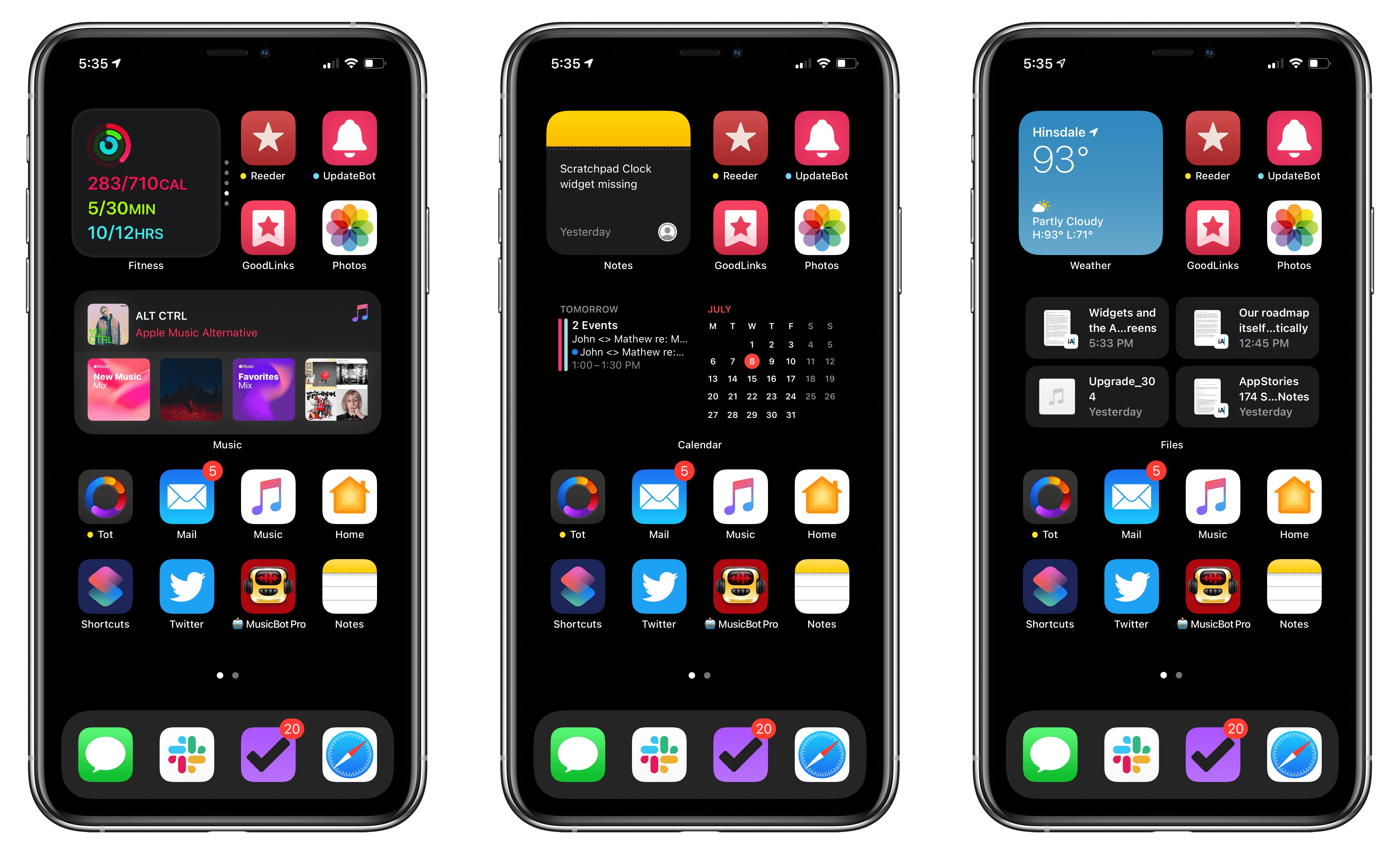
So far, my favorite widgets are Notes, Photos, Fitness, Weather, and Calendar. My small Notes widget opens a single note called Scratchpad for jotting down quick notes. I’ve done something similar in the past with a Home screen shortcut that Federico wrote about for Club MacStories, but the widget has the advantage of previewing a snippet of the text stored in the note, which I like a lot. My medium-sized widget includes Notes too, but there, it displays the three most-recently edited notes in my macOS Review folder, which is a set of notes I’ll be accessing all summer long. Notes is a great example of deep linking, which eliminates drilling down into a folder structure or searching for frequently-used notes.
The Photos widget has been a delightful surprise too. I don’t spend much time browsing through my photos in the Photos app. I’m not sure why, but it’s just not something I do very often, even though I use the Photos app every day to access recent images and screenshots that I take. Having the Photos widget surface pictures of friends and family from years past throughout the day has made my Home screen feel more personal and led me to share those shots more often too.
The Fitness, Weather, and Calendar widgets are all widgets that eliminate dipping in and out of those apps throughout the day. More often than not, the information I need is immediately available in the widget, but I can always tap it to access what I want.
The most recent addition to my medium-sized widget is Files, which debuted with the second developer beta of iOS and iPadOS 14. I love the idea of picking up where I left off in a text file or Numbers spreadsheet without having to navigate to it. However, I expect I’ll use this widget more often on the iPad where usually handle those sorts of tasks.
My second iPhone Home screen includes a medium-sized Maps widget and apps that I use frequently, but more sporadically. The remaining pages of apps that used to clutter my iPhone have been hidden away and are now accessible using search or the App Library.
The new layout and reduced number of apps on my two Home screens have made my iPhone feel far less cluttered and easier to navigate. However, what has allowed it to stay that way as I download new apps is the App Library. New apps are automatically added to the App Library, avoiding the Home screen creep that used to happen as I added new apps to my iPhone. Now they’re easily found in the Recently Added folder and can be dragged out onto a Home screen if I prefer. I also appreciate the dedicated TestFlight folder, which makes it easier to find all but the most recently-added apps I’m currently testing in one place, neatly arranged in alphabetical order.
My setup on the iPad is simpler by virtue of the limitations on how widgets are used on the iPad. Widgets are limited to the left sidebar of the iPad’s first Home screen, and there is no App Library. In an interview with Marques Brownlee, Craig Federighi suggested this was an intentional design choice related to creating a ‘balanced’ layout on the iPad. Stephen Tonna from Apple’s product marketing team responded similarly to a question from Federico on Connected that mixing widgets and apps on the iPhone was necessary on the smaller screen, whereas there was already a spot for widgets carved out on the iPad’s Home screen.
Although I understand the thinking behind the limitations, I hope Apple reconsiders. Multiple Home screens are no more necessary on the iPad than they are on the iPhone. Search makes it dead simple to launch apps on an iPad, and adding the App Library to the mix would eliminate the need to manage folders, multiple screens of apps, and the Home screen creep that occurs as you download new apps. Next to my iPhone, my iPad Pro now looks like a cluttered mess, and the process of organizing it into something approaching my iPhone is more work than I’d like, especially since I know new apps I download will start adding to the clutter all over again.
What’s also striking to me about the inability to place widgets anywhere I’d like on my iPad Home screens is that Smart Stacks feel like a solution designed to scale widgets from the iPad’s bigger screen to the iPhone’s smaller one. On an iPad, the bigger screen would reduce the need to stack widgets. I’m a fan of the smarts built into stacks, but if I had the space to build fewer or shallower stacks, I would.
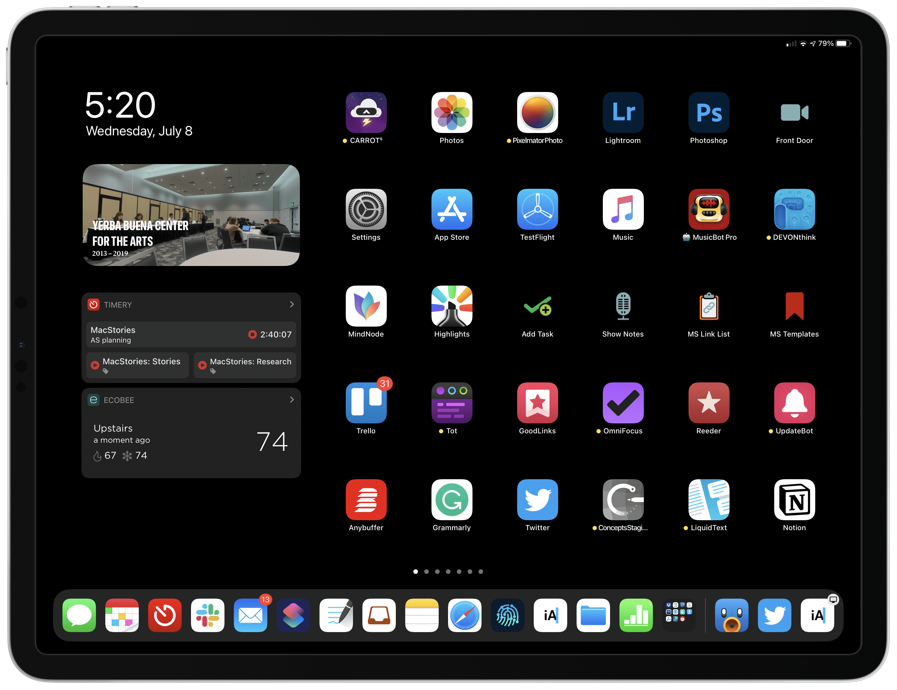
As a result of the iPad’s limitations, I’m currently using a single medium-sized Smart Stack on my iPad Pro that includes Weather, a Notes folder, Calendar, Recently Played, Files, Photos, Top Stories from Apple News, and Nintendo news from Apple News. The widgets themselves are just as useful as on my iPhone, but I’d prefer to mix and match sizes around my entire Home screen.
What You Can Expect from Your Favorite Apps
As much as I enjoy the Apple widgets that have shipped with the iOS and iPadOS 14 beta, I’m even more excited to see what third-party developers do with them. This is a terrific opportunity for developers to make users’ experiences more immediate and personal by bringing content buried deep in apps to the surface and making commonly-used features more accessible.
It’s very early days, but developers have begun sharing prototypes and pre-beta screenshots of widgets they are building. After seeing a few interesting widget concepts on Twitter, I asked developers to share more of what they are creating and got a lot of fantastic responses, some of which I thought I’d share as a sneak peek at the kinds of things that will be possible this fall.
Bear in mind that these are prototypes and pre-beta screenshots of widgets. I haven’t tried these widgets yet, and I’m sure they will change, and some may never ship. Still, the variety of the widgets I’ve seen so far is encouraging. I expect there will be many widgets to choose from in the fall, another reason why I’d like to see Apple open up the entire iPad Home screen to them.
Here are a handful of my favorites so far:
A Drafts proof of concept with deep links into different parts of the app, to workspaces, and individual actions and commands:
Widget proof of concept done. Can be used in any size, and each of the cells can be configured to link to a built-in command, a workspace, or any action in your action list (layout/theming still rough). On to implementation… pic.twitter.com/qvo3ll1V3F
— Greg Pierce (@agiletortoise) July 1, 2020
A Daily Dictionary word-of-the-day widget:
Not too shabby. pic.twitter.com/SJ9XO4Sa3w
— Benjamin Mayo (@bzamayo) July 6, 2020
Upcoming releases in MusicHarbor:
I’m planning a few for MusicHarbor. Here’s what I’ve got so far for latest releases: pic.twitter.com/CLfuzgvfR7
— Marcos Tanaka (@mactanaka) July 7, 2020
A now playing widget for an upcoming app from Justin Hamilton:
i made a now playing widget for my WIP music app! https://t.co/ltnKSgo1N4
— certified apøcaholic💙💜❤️ (@jwhamilton_) July 8, 2020
Credit card reward tracking with CardPointers:
Here’s what I’ve got so far to help users keep track of cash offers across all of their credit cards; really excited about widgets and the much-improved Watch complications thanks to SwiftUI. pic.twitter.com/MtVvf6ccQp
— Emmanuel Crouvisier (@emcro) July 7, 2020
Website analytics with GAget:
iOS 14 is going to be awesome 😉 pic.twitter.com/y5itYFOcik
— GAget App (@GAget_app) June 29, 2020
A Streaks prototype that displays your habit tracking progress:
Working on a range of options for display / theming / interactivity for the @TheStreaksApp. pic.twitter.com/Gk9ukSVUaQ
— Quentin Zervaas (@qzervaas) July 9, 2020
Calory and WaterMinder are a terrific fit for widgets:
Getting there!! pic.twitter.com/ePDsx9iEp9
— Kriss Smolka (@ksmolka) July 8, 2020
Skiing stats with Slopes:
These are live, worked on them this week. Idea being Slopes = journal, so helping users feel good about their stats and look back on where they have been. pic.twitter.com/U7IvS4bPel
— Curtis Herbert (@parrots) July 7, 2020
Scriptable as a widget-building tool:
Starting to feel like I have the bare minimum of APIs to make a widget that looks decent using Scriptable 😃 pic.twitter.com/FyAfem2uOo
— Simon B. Støvring (@simonbs) June 28, 2020
Personalizing Apple’s Most Personal Devices
Adding widgets to the Home screen and moving some apps into an App Library is part of a broader shift across iOS and iPadOS. Starting with the Files app, Apple has slowly opened up the app-centric model of its mobile devices to put greater emphasis on files and content. The changes don’t replace the familiar app-centric model, but they supplement it, surfacing relevant information outside dedicated app silos with apps like Files and Shortcuts, and even Siri. With widgets, that information takes the natural next step directly onto the Home screen, and with the App Library, apps as silos that contain information are deemphasized.
Stacks are widgets’ superpower. I eliminated a dozen app slots on my iPhone Home screen but replaced them with thirteen widgets. Of course, those widgets aren’t visible simultaneously, but between their built-in smarts and the ease of flicking through them quickly, they don’t need to be. Add deep linking to photos from years past, notes stored in nested folders, and my favorite playlists, and the result is a more personalized, relevant Home screen experience that requires far less tapping around on my phone.
Adjusting to the new setups was far easier than I expected, and even with just the system widgets, the experience has been outstanding. I’d love to see Apple add a Clock widget so I can quickly start timers and see the time in other cities. I’d also like a Home widget for accessing favorite rooms or scenes. Still, what I’m looking most forward to are the third-party widgets that will launch in the fall. That’s when we’ll see Home screen personalization really take off and become interesting. Until then, I’m looking to see what MacStories readers do to customize their Home screens with the iOS and iPadOS 14 public beta.