One of the promises regularly made by apps transitioning to a subscription model is that they’ll be able to deliver more regular, incremental updates rather than going untouched for extended periods of time, and they can also focus on adding functionality that existing users will appreciate rather than needing to build something entirely different to attract a new target market. Ulysses has been a subscription app for nearly three years already, and I believe it’s one of the apps doing the best job of delivering on both of those fronts.
A quick search on MacStories will show that I’ve covered Ulysses a lot, in part because it’s my primary Markdown editor, but also because there are consistently several updates per year that stand out as noteworthy and meriting a fresh review. Today’s version 20 is no exception, introducing an advanced grammar and style check ‘revision mode’ on the Mac (coming soon to iPad and iPhone) and a new dashboard view across all platforms. Both enhancements leave what was already great about Ulysses alone, while offering valuable new utility for writers sure to delight existing users and perhaps even draw a flock of new ones.
Dashboard
I’ll begin by covering Ulysses’ new dashboard because it’s where the other new feature, revision mode, lives. The dashboard will look a little different on each platform, but on Mac and iPad it appears as a sidebar panel located to the right of the editor. Previously, this section was the attachments panel and was dedicated to storing attachments like notes, keywords, writing goals, PDFs, images, and more. All of this functionality remains in the new dashboard, but it’s been restructured and upgraded across all platforms in the more powerful dashboard.
By encompassing both the contents of the old attachments panel and brand new features, the dashboard has to contain a lot of information. For this reason, it’s divided into a handful of different sub-pages, all of which can be accessed individually to gain more detail, but they also all appear in a single overview area. This overview, the first page of the dashboard, provides insight into various information about your current sheet broken into sections that correspond with the other dashboard sub-pages. Essentially, the overview page provides a glance at lots of data at once, but when you’re ready to interact with any of that data you’ll be moved to a section’s own dashboard page.
There are slight changes to the way the dashboard appears on each platform, but I’ll focus on the iPad app since that’s the version I use most regularly. On iPad you’ll see several sections in the dashboard’s overview screen: Progress, Keywords, Navigation, and Attachments.
- Progress: If you have a writing goal set, your progress will be displayed here, and if not you’ll see multiple statistics like your character and word counts as well as average reading time.
- Keywords: You can add keywords from here as well as view existing saved keywords.
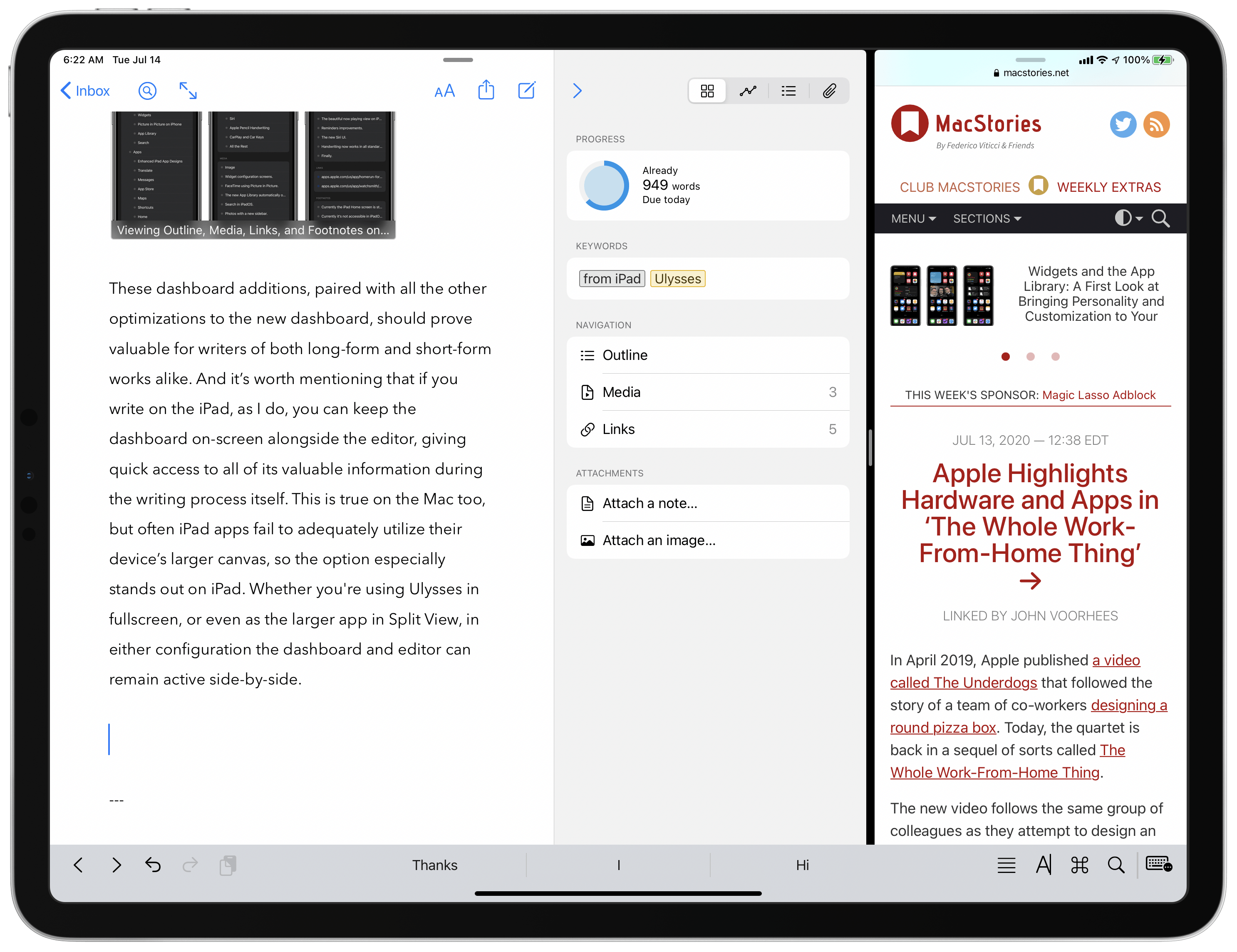
- Navigation: This will show a variety of data depending on the contents found inside the body of your sheet; it can contain an Outline, Media, Links, Footnotes, and Annotations.
- Attachments: Notes and image/document attachments which are stored outside the body of your sheet can be saved and accessed here. Think of this as a separate area for storing reference material.
As I mentioned, much of this functionality has been available in the previous attachments panel, but I’m a fan of the redesign to consolidate everything in the new dashboard, and I particularly want to highlight the brand new features which are found under the Navigation section.
The Outline is perhaps the most valuable addition, enabling you to track the structure of your sheet as it’s being written. All appropriate headings from your sheet will automatically be reflected in the dashboard’s outline, and you can tap or click on any outline heading to automatically scroll to that section of your document. Apps like Pages and Google Docs have offered similar outline features for years, so there’s nothing innovative happening here, but it’s a welcome addition nonetheless.
The other supported Navigation types work similar to the Outline: with Media, Links, Footnotes, and Annotations, as you add these content types to your sheet, they’ll be automatically reflected in the dashboard. With media you’ll see the image caption in the dashboard, or for media without captions you’ll simply see an ‘Image’ designation; links are displayed in their raw URL form in the dashboard, in contrast to the way they’re hidden in a sheet’s body; footnotes and annotations contain excerpts from those saved writings (and both comments and annotations fall under the annotation heading here). Like with headings in the Outline, tapping on any of these different Navigation shortcuts will jump you to the part of the document containing them. And when you do so, the appropriate item will even pop forward from the screen briefly so you can easily identify it. In practice, the Navigation enhancements are a fantastic addition I expect to find myself using often in the future.
These dashboard additions, paired with all the other optimizations to the new dashboard, should prove valuable for writers of both long-form and short-form works alike. And it’s worth mentioning that if you write on the iPad, as I do, you can keep the dashboard on-screen alongside the editor, giving quick access to all of its valuable information during the writing process itself. This is true on the Mac too, but often iPad apps fail to adequately utilize their device’s larger canvas, so the option especially stands out on iPad. Whether you’re using Ulysses in fullscreen, or even as the larger app in a Split View configuration, in either setup the dashboard and editor can remain active side-by-side.
Revision Mode
The other tentpole feature of Ulysses 20 is another new aspect of the dashboard, only it’s currently Mac-exclusive: revision mode.
Before I go any further, let me assure all the iPad users reading this that Ulysses’ team has committed to bringing revision mode to the iPad and iPhone in an update this fall, so this isn’t a case of the iPad being viewed as a “less professional” platform – there simply wasn’t enough time for the feature to be ready for today’s update across all platforms. It’s understandable, and I’m excited to see revision mode arrive on iPad in a few short months.
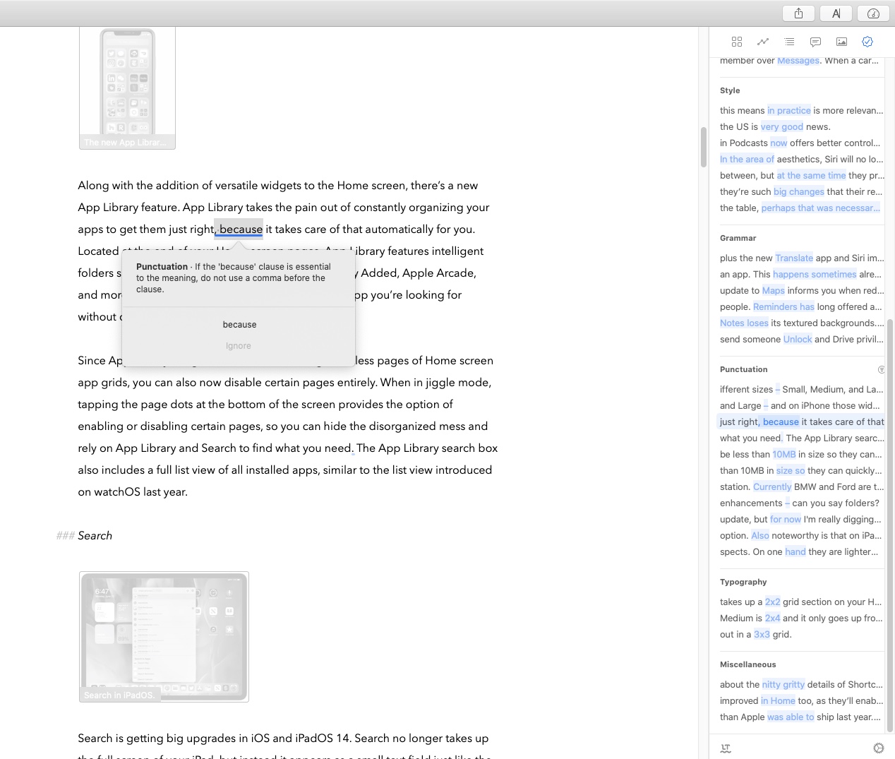
That concern out of the way, what exactly is revision mode? It’s actually made up of several different components. Accessing the dashboard’s Revision page shows that the top of the revision list is dedicated to notes you or a collaborator have made for later review. Under a section dubbed Annotations, you’ll find all comments and annotations made to your sheet so you can take care of them one at a time.
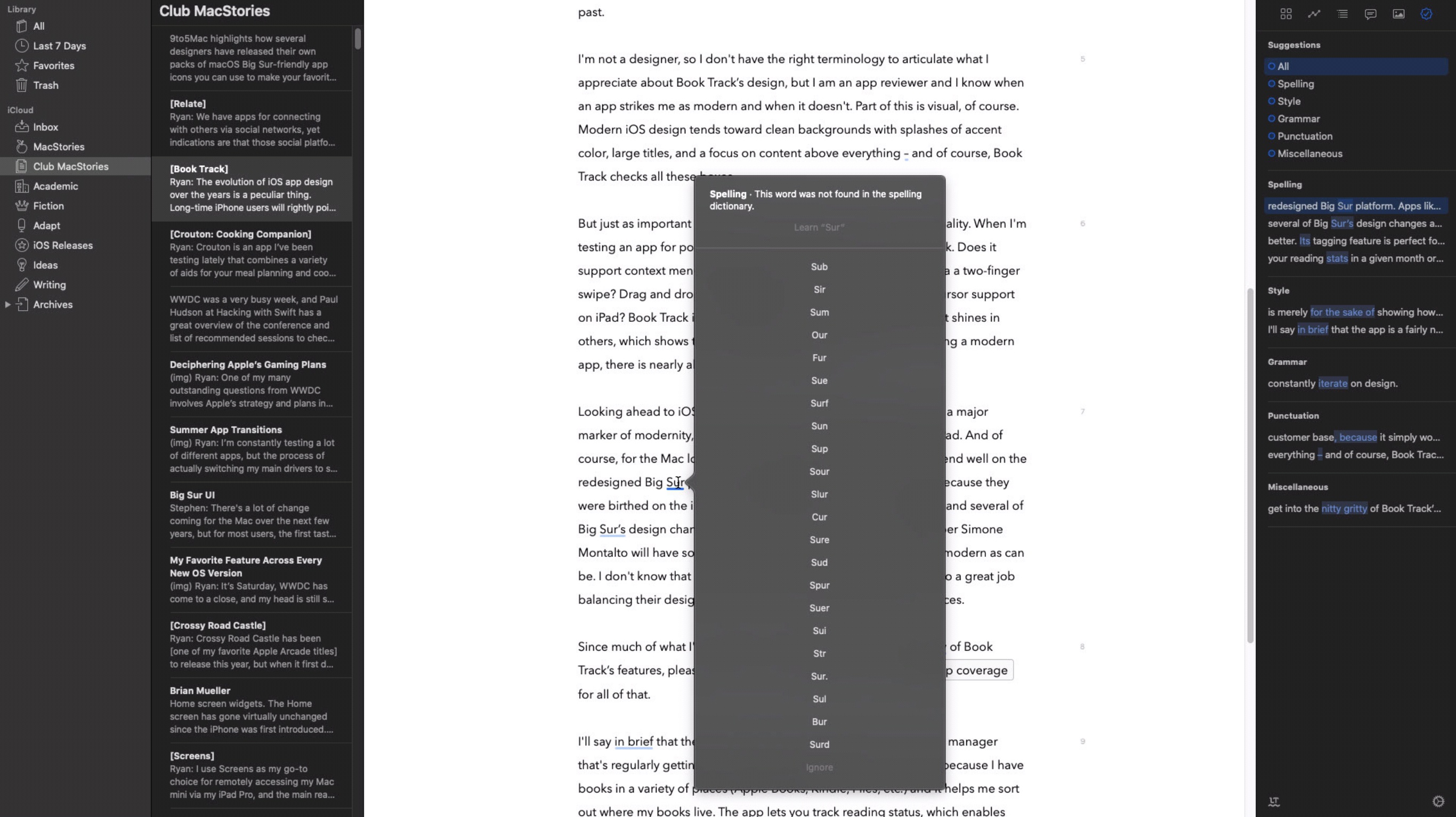
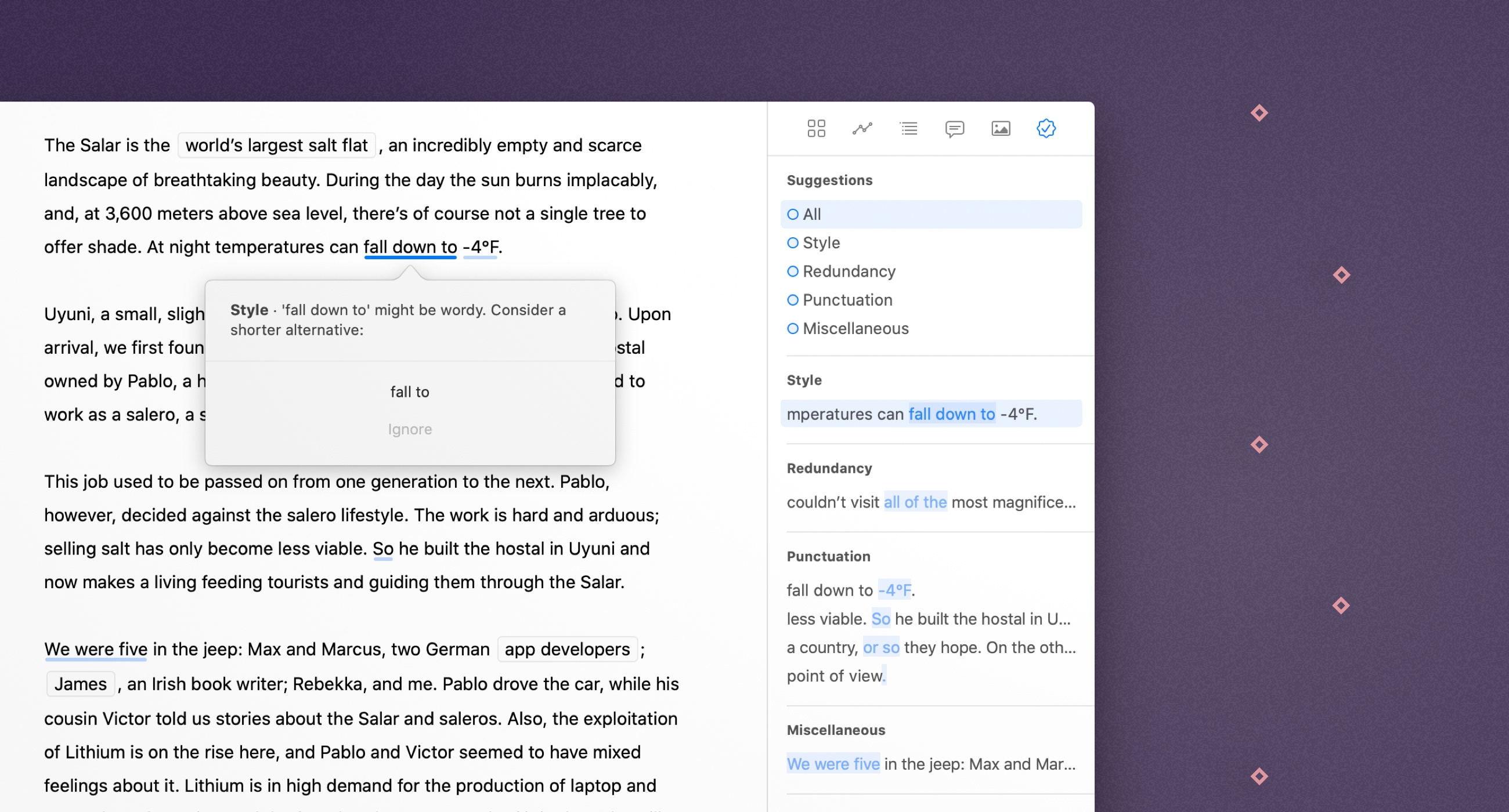
The second aspect of revision mode is integration with the system spell checker for identifying any typos in your text. Each of these is outlined under the Spelling heading; click one and you’ll be taken to the spot it appears in your text, or with a double-click you’ll not only navigate there but also have a pop-up window explain why the word was identified as incorrect and see options for replacing it with a specific suggestion, ignoring the misspelling altogether, or adding the word to the system dictionary.
If Ulysses’ team had stopped here, revision mode would have been a nice but very basic feature. However, what’s particularly valuable is its advanced check options. For this, Ulysses has integrated the technology of the third-party LanguageTool Plus service, but at no additional charge, to offer an extra layer of more powerful and nuanced revision options. When activated, advanced check offers suggestions on a wide array of textual elements, including:
- Capitalization
- Style
- Redundancy
- Grammar
- Punctuation
- Typography, which identifies things like extra spaces in your text.
- Miscellaneous, which involves semantic issues such as suggesting a preposition that more commonly appears with your sentence’s context.
Essentially, Ulysses has taken a Grammarly-like tool and built it directly into its editor, included for free as part of a standard Ulysses subscription. I haven’t used the feature for more than a few days, and have regularly found myself disagreeing with its suggestions, but the beautiful thing about the feature is that it’s only suggestions. I can benefit from the changes I recognize as improvements, and ignore the rest. And it’s all quick and easy to do. From the dashboard I can browse each of these various areas that may need revision, then by double-clicking on each one I get an explanation from Ulysses about its suggested change and can implement or ignore that change from the pop-up box.
As I mentioned earlier, these advanced elements of revision mode are optional, which is important if you’re concerned at all about the privacy of your data. When you first open the dashboard’s revision mode page for a given sheet, you’ll see a Check Text button that needs to be clicked before the processing takes place. It all happens very quickly, but behind the scenes your text contents are being sent to Ulysses’ own servers, then forwarded to the LanguageTool servers for analysis. Your text remains on those servers while it’s being processed, then deleted shortly after the text checking has completed.
By partnering with LanguageTool, Ulysses is not only able to offer an extensive set of powerful text checking tools, it also makes them available in over 20 languages. The scope of what’s been done here is impressive: pairing the intelligence of LanguageTool’s service with the UI of Ulysses’ app makes Ulysses more compelling a writing platform than ever before.
Ulysses 20 is an update all about the quality of its improvements over quantity. On paper there are only two new features, but each of these features represents a major advancement for the app. The dashboard has turned a section of the UI I previously never used into something I expect to rely on in my daily work. And revision mode on the Mac, while I’ll largely wait for its iPad equivalent to launch before using it often, has the potential to improve users’ writing significantly, and without the hassle of installing an additional tool. The advanced text check features provided via LanguageTool Pro also represent the kind of feature Ulysses probably never could have offered outside of bringing in recurring revenue through its subscription model.
Ulysses 20 is available now on Mac and iPad/iPhone. It’s a free download, but is read-only until you sign up for a subscription.